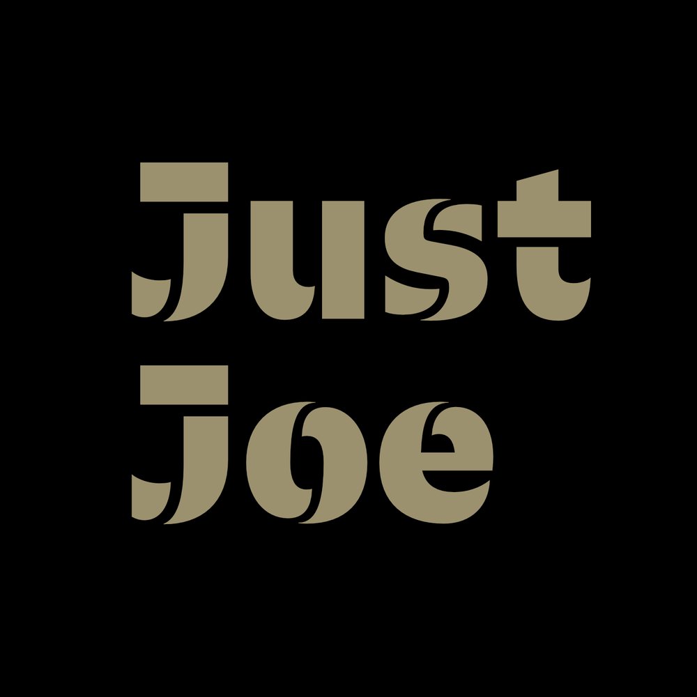


In this self-exploration/practice project I wanted to develop a brand and identity system that was interesting and fun. Perhaps I had been spending too much time at Starbucks and was getting bored but my concept was to develop a competitor to global coffee giant. The goal was to create a brand that had a touch of sophistication but would be welcoming to anyone who needed a java fix. The inspiration for the type and bright green choices came from neon lights. My thoughts were how cool would this sign, "Joe's Cafe," be lit up in neon with the vibrant font, Lovelo Inline. It's paired with the versatile Klinic Slab which is useful for print collateral such as menu's, letterheads, and business cards.
So, the color palette is fairly neutral with the gold and slate which is great for creating a quite and relaxing environment but for that jolt or perk up you need there is a splash of the energetic green! The O in Joe's is manipulated to give the space at the top in order to create the "power" icon. Which is relevant for a couple reasons, one is obviously coffee and the second being the neon light.
I took my time with this project and worked hard to figure out how I wanted the final version of the locked up logo to look. Once I had that in place, it was just a matter of creating solutions for the printed materials which are all grid based.
This was a fun project for sure!