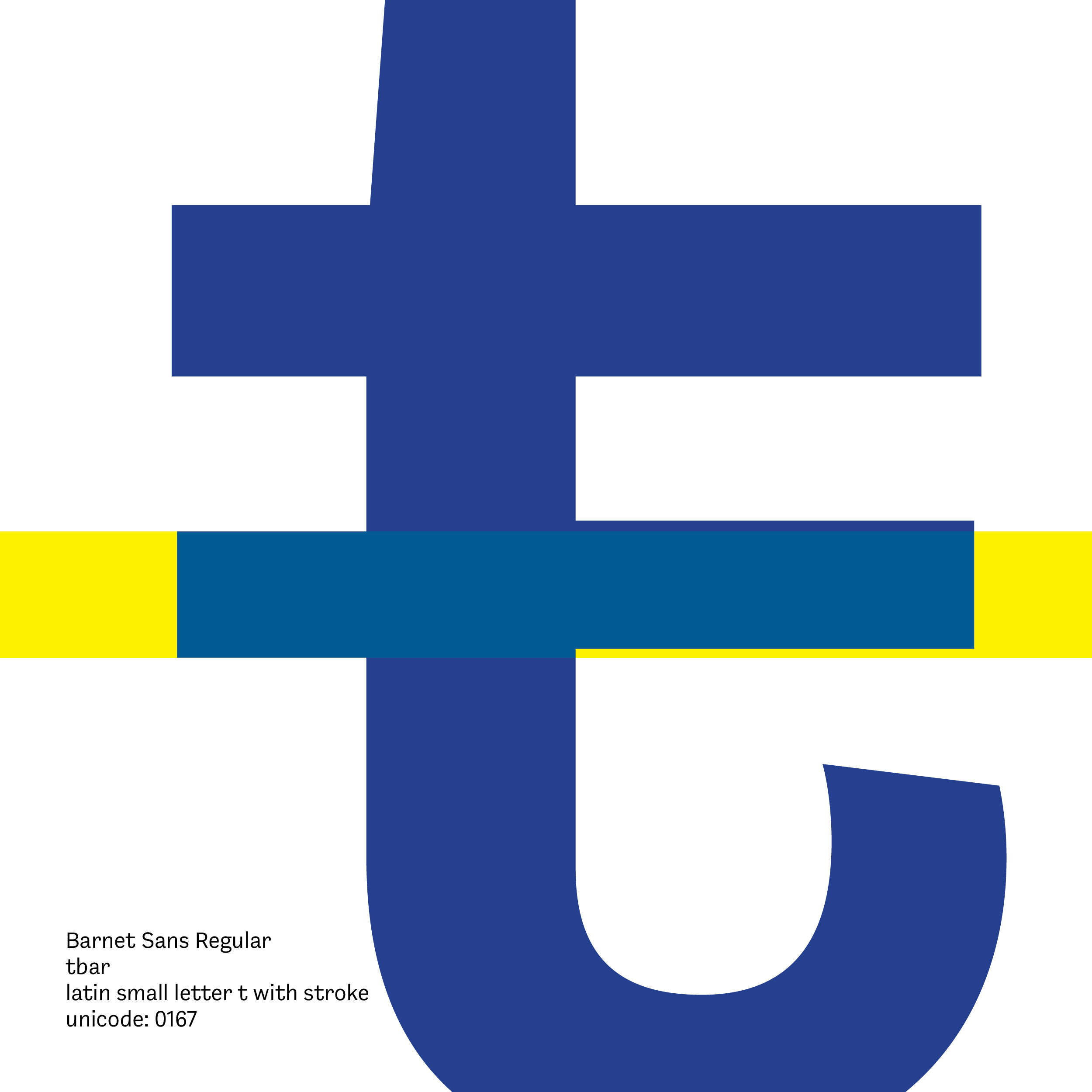
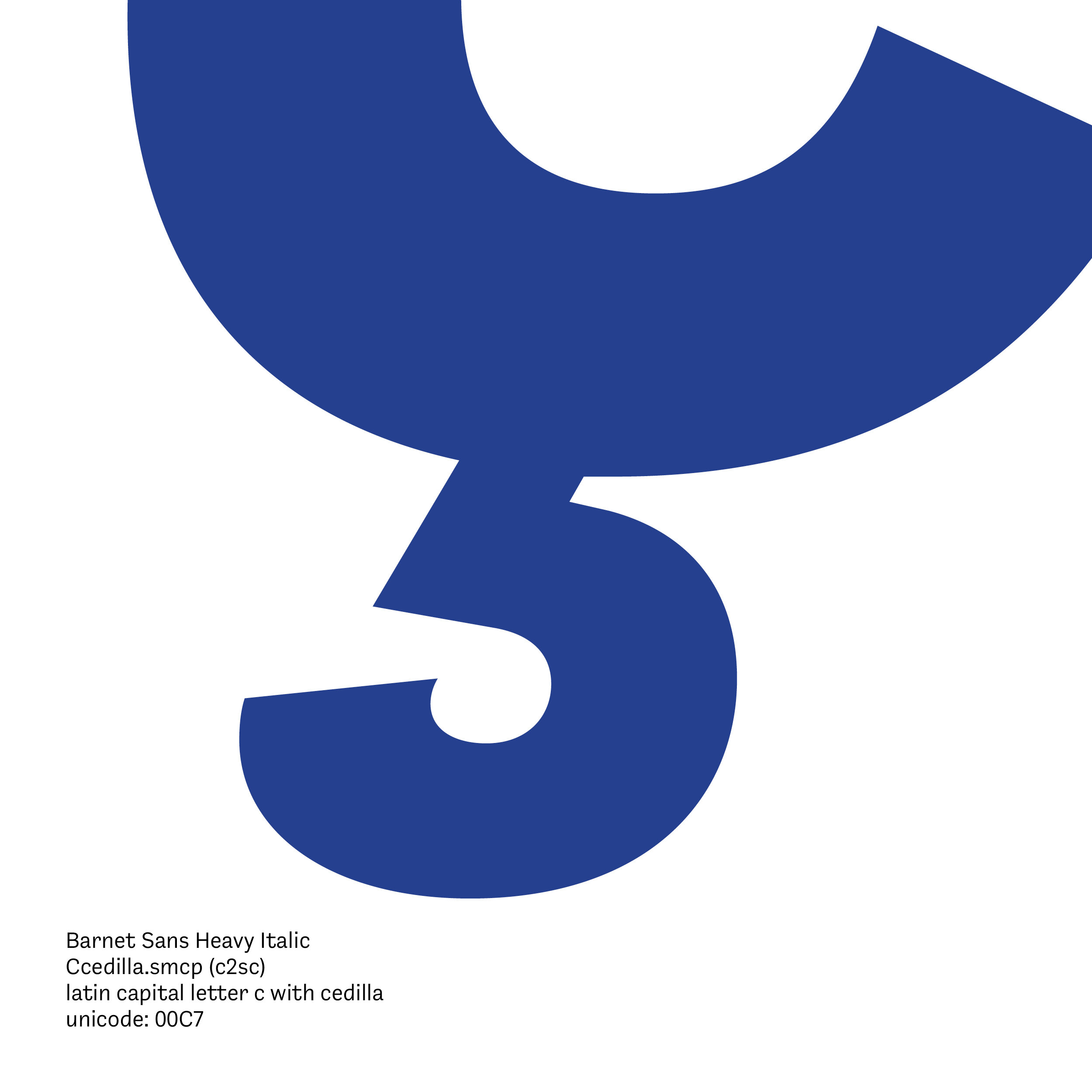
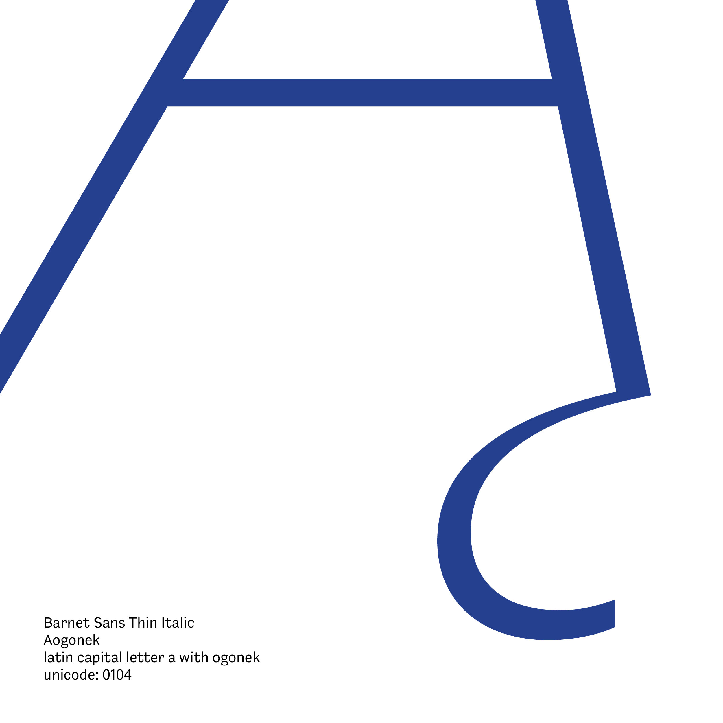
Barnet Sans
My first commercial release is due out in early 2020 with award winning digital font foundry, The Northern Block. The design is a humanist structured sans serif with grotesque features which first appeared in the late 1800s. This typeface features 14 total styles comprised of seven weights, thin to black, in both upright and italic. It is a utilitarian font family created to work well in both print and digital settings, for almost any job.


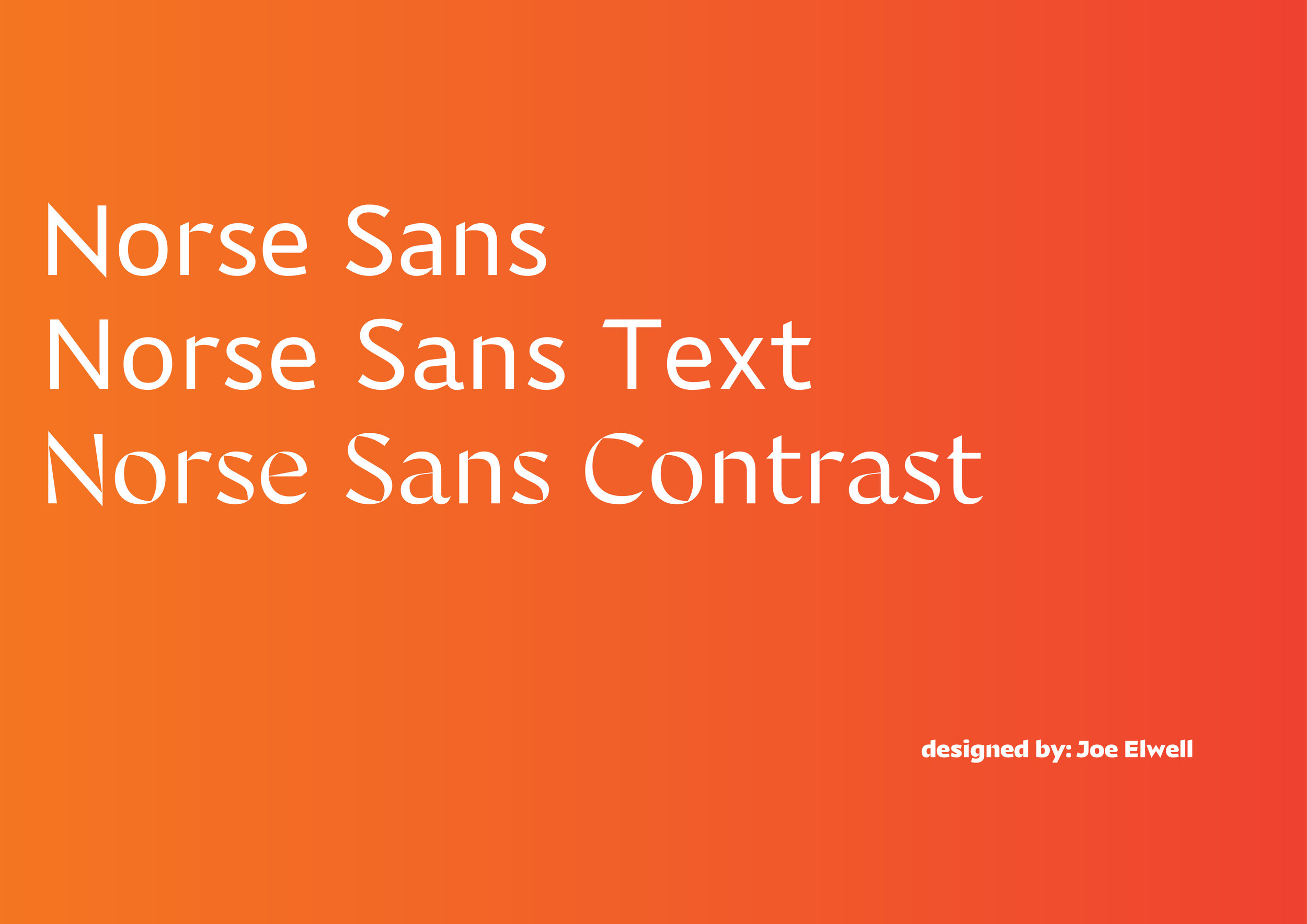
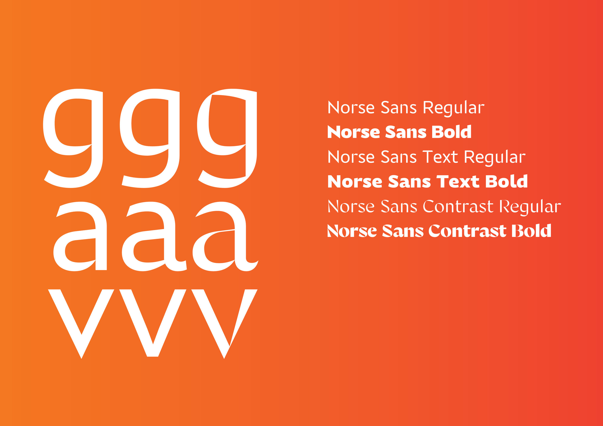
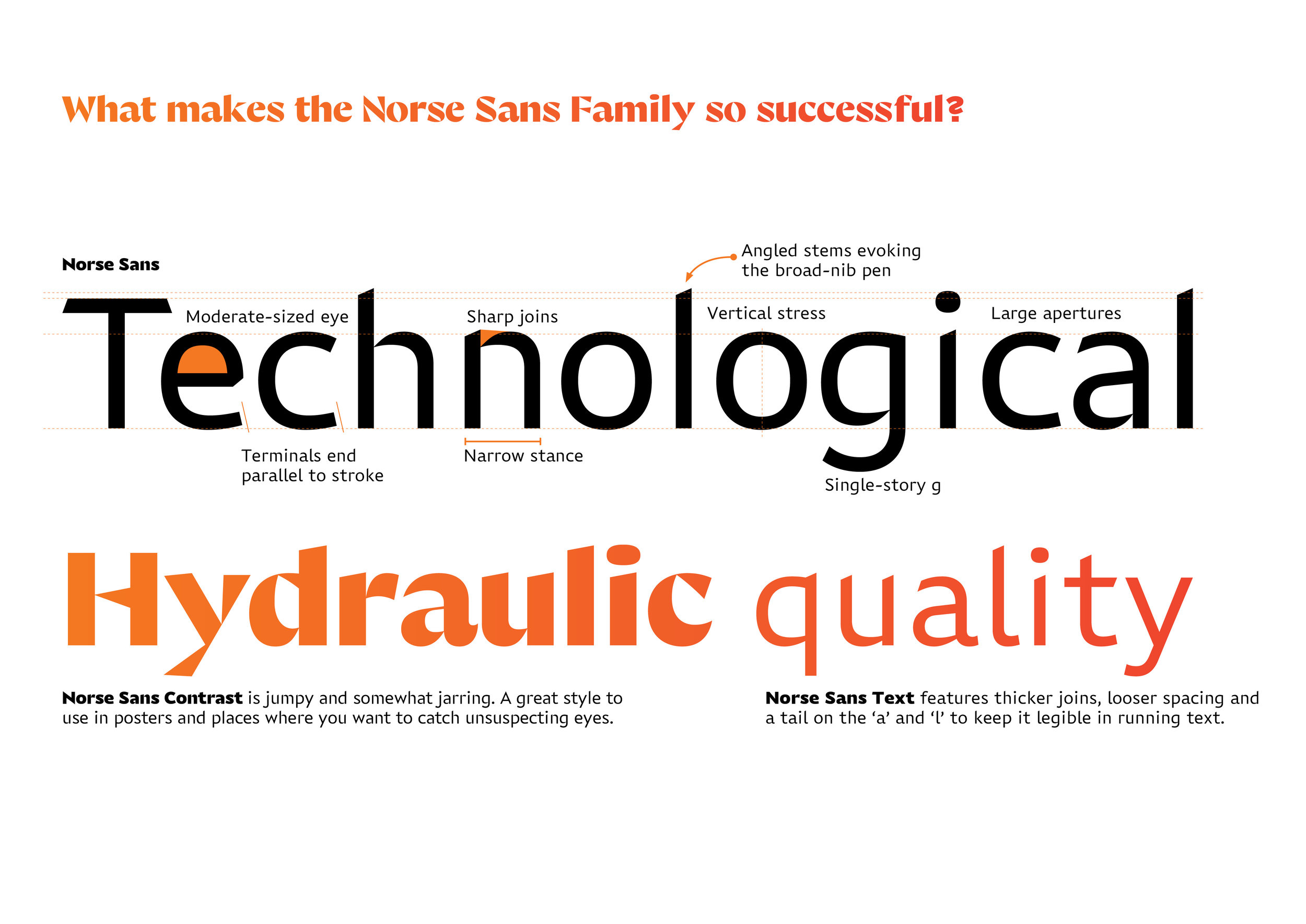
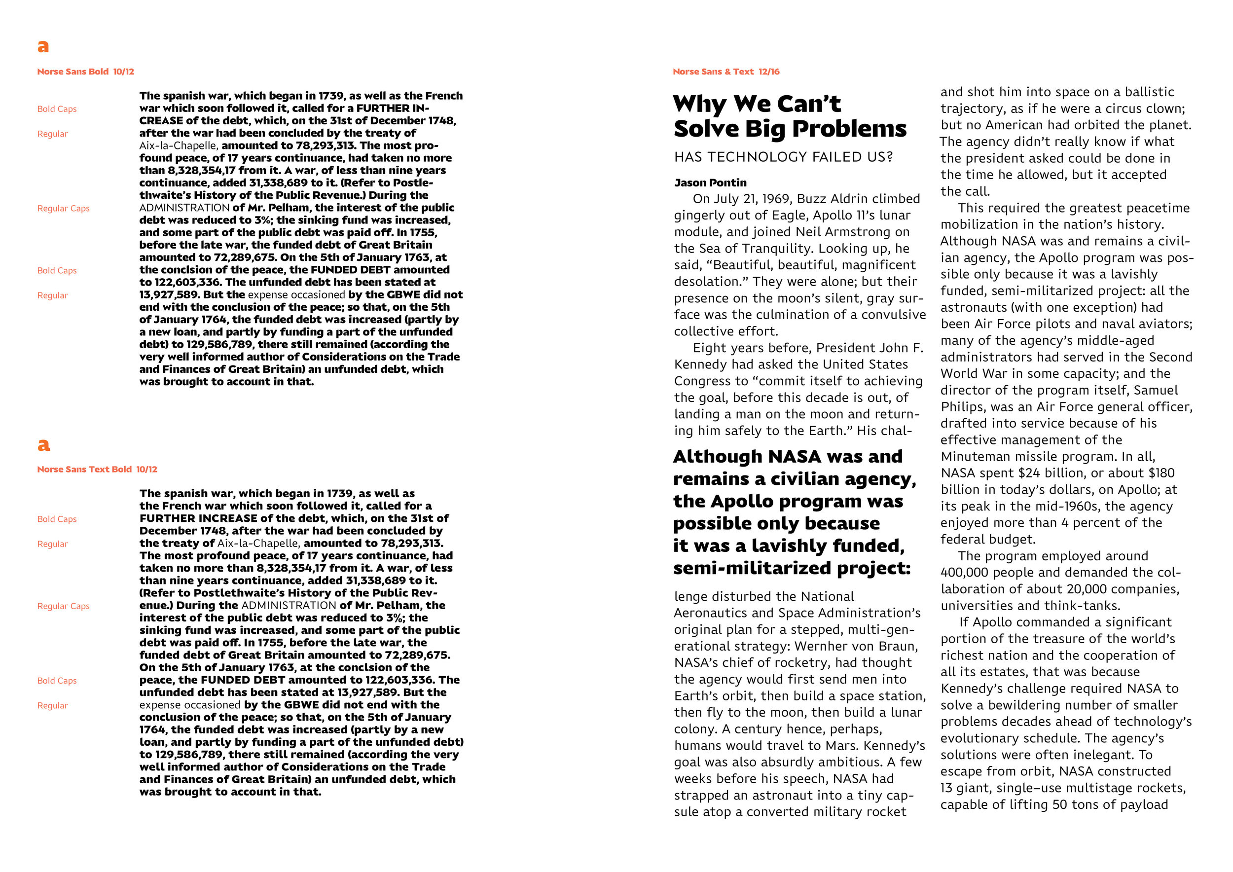
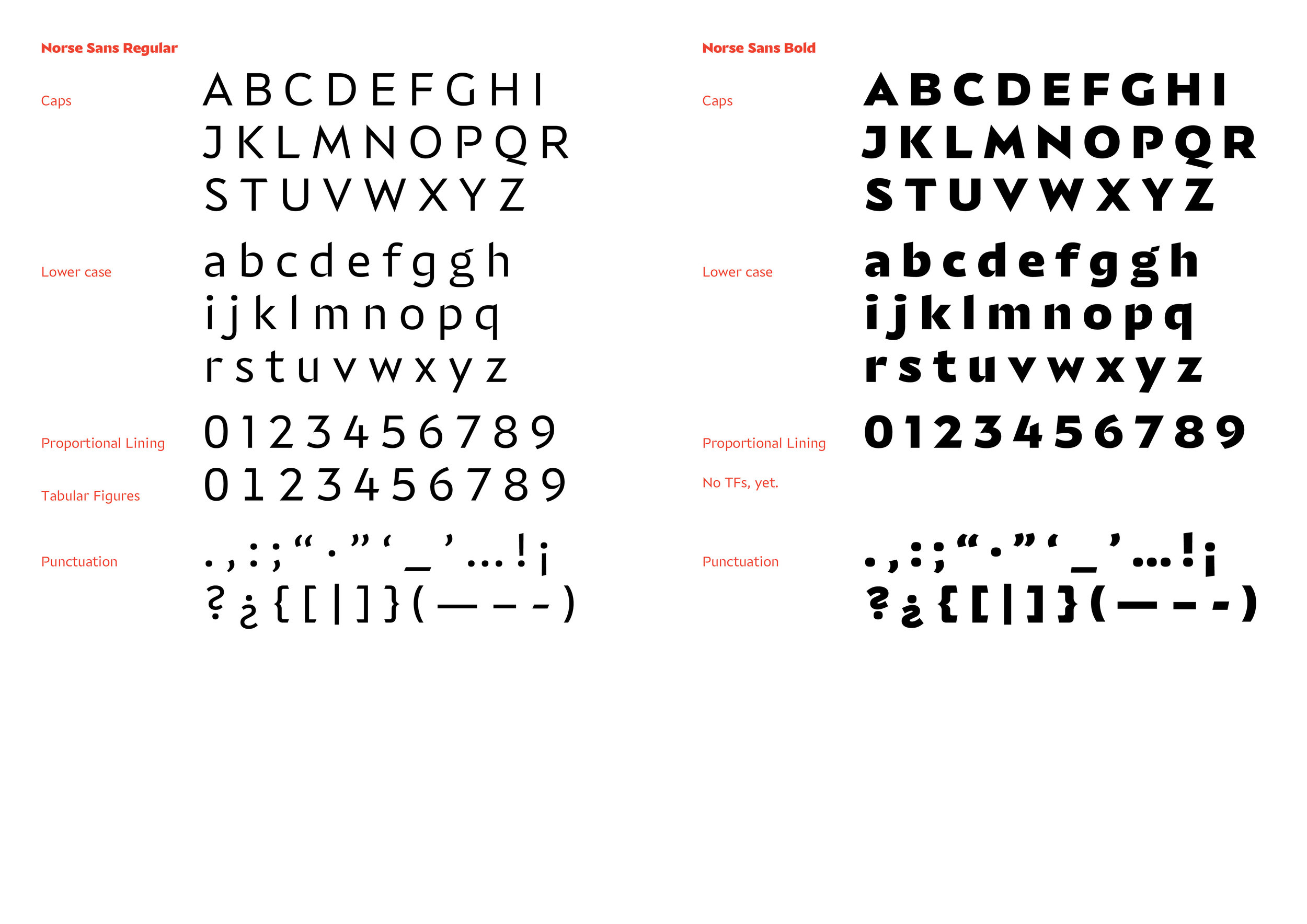
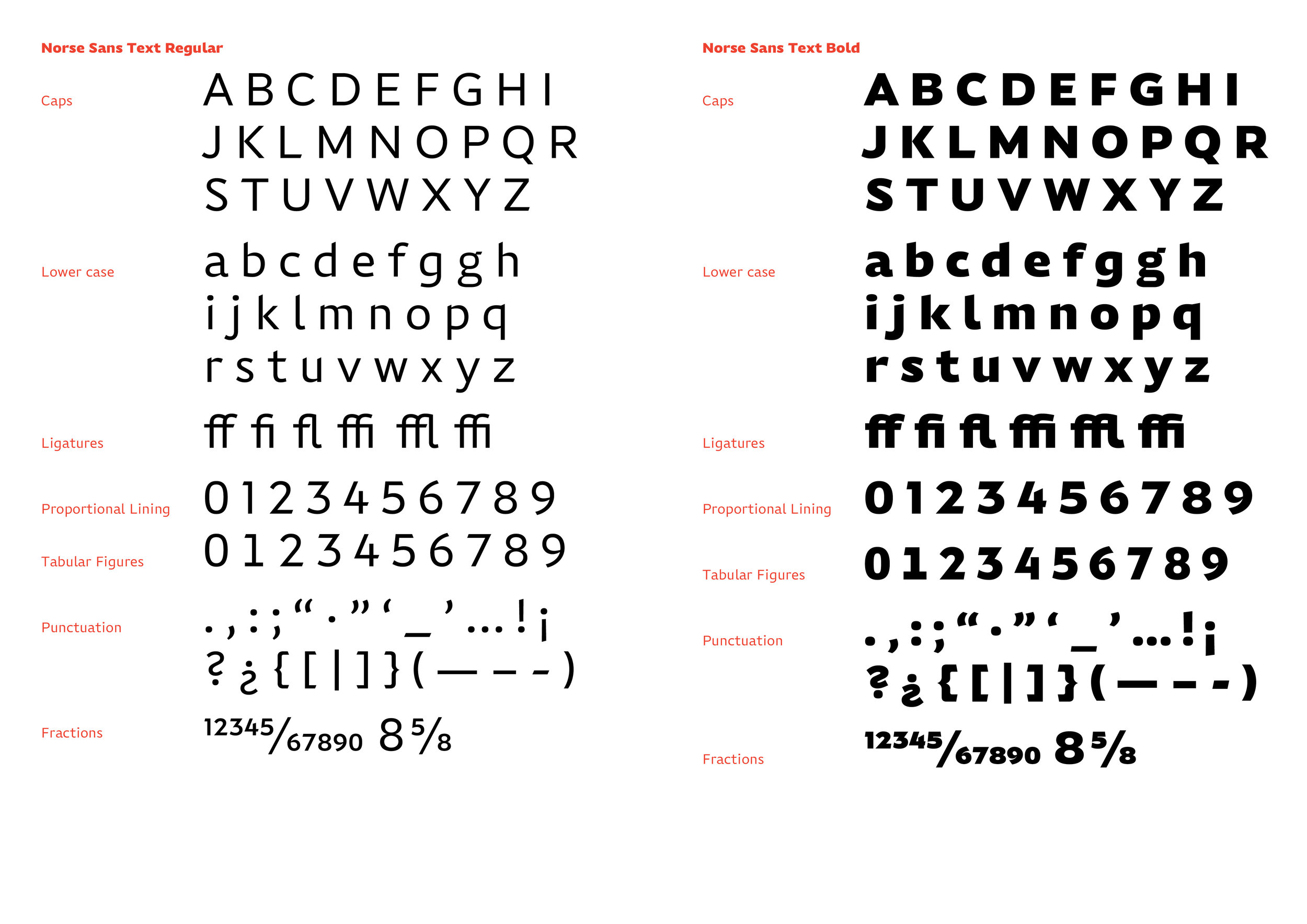
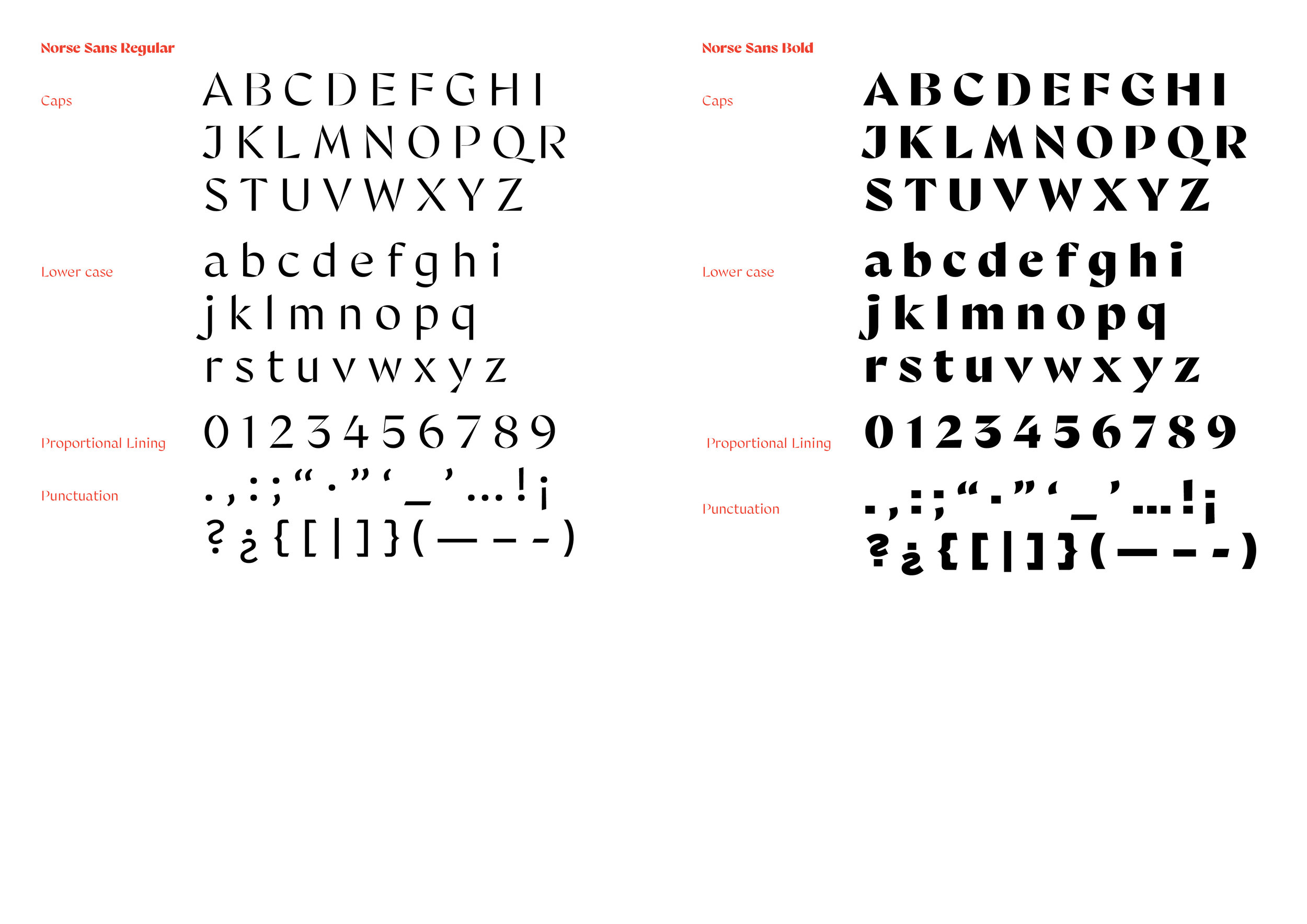
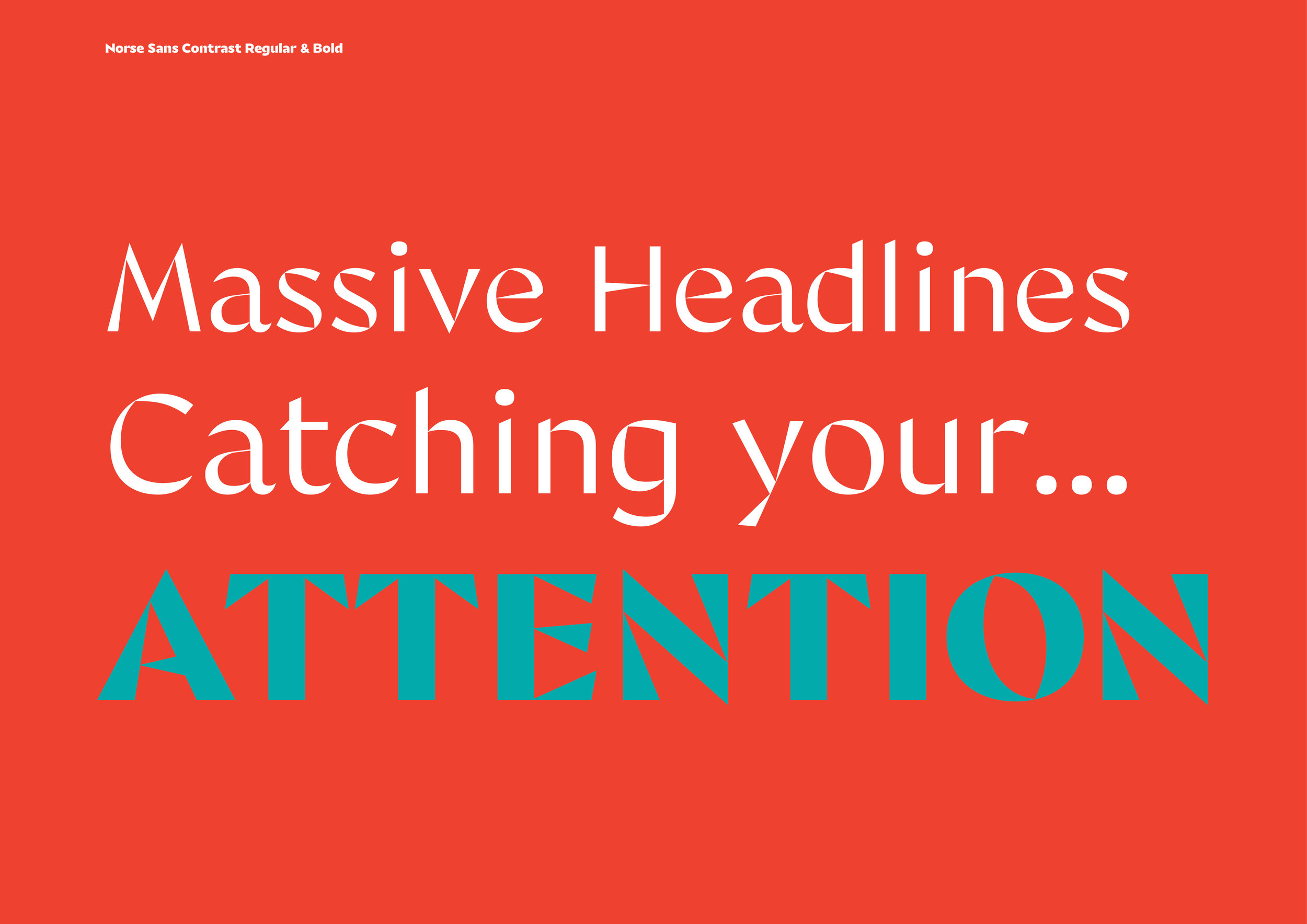
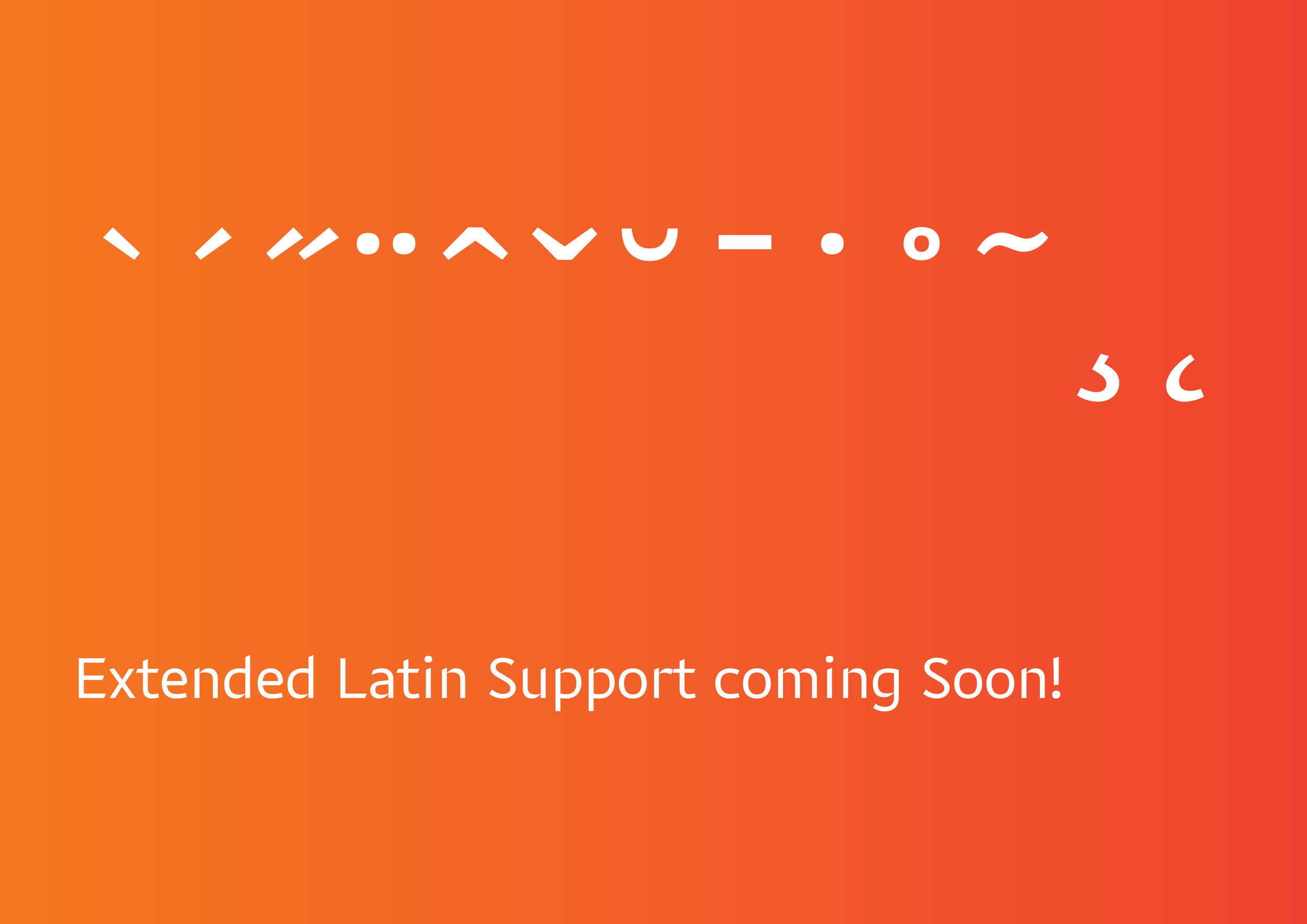
Norse Sans
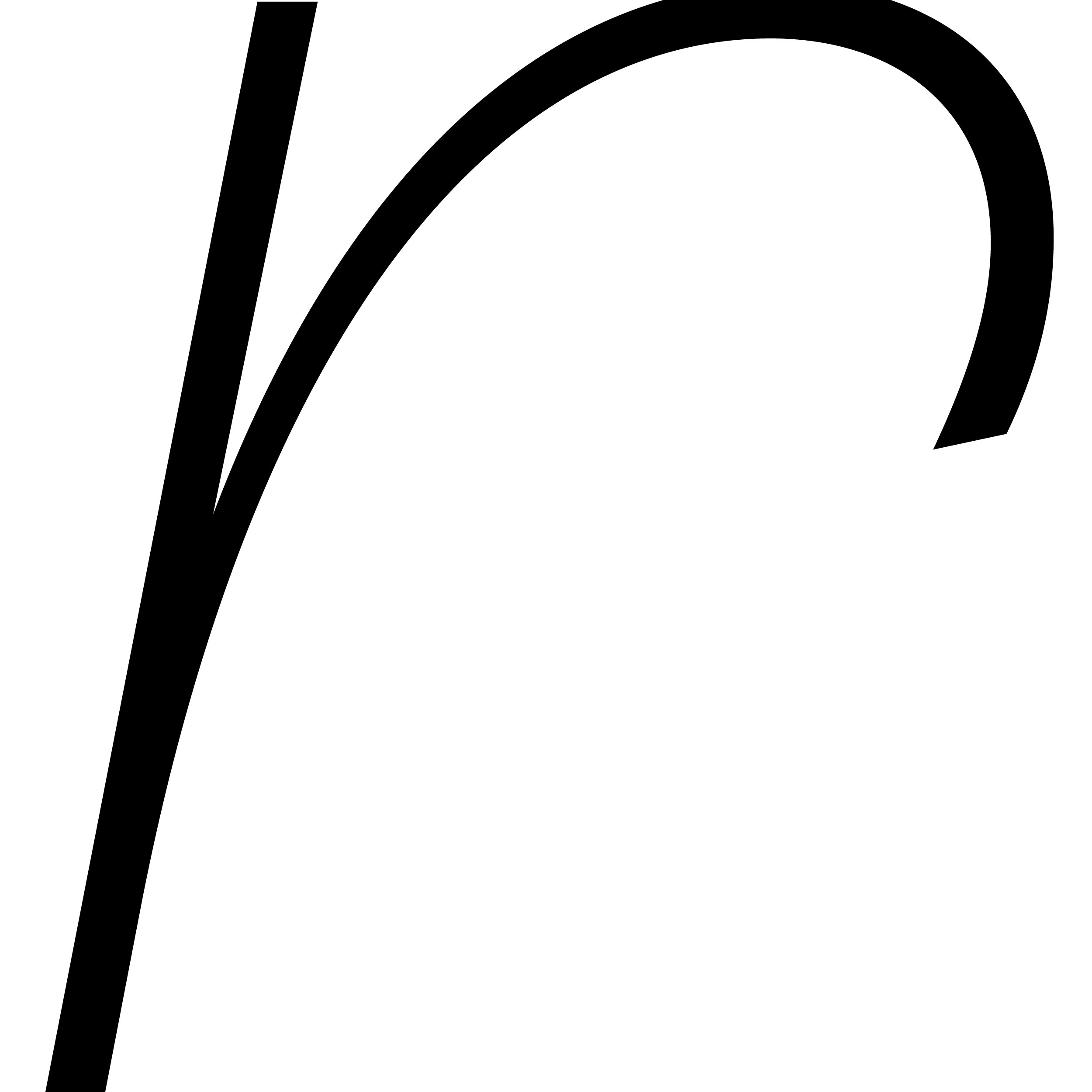
The original concept was based on a broad nib pen with a dutch humanist influence. The elements that make this distinctive are the very thin joins in letters like /n and /p. There are three optical axis masters that are designed to perform in a variety of settings from text, headline, to large display. In the text version the joins are thicker and spacing is looser. Details were then added to the display (non-text) style. It’s all really explorative at this rate. In the near future I will look to add italics. Here is an updated PDF Type-Specimen, which includes one new high-contrast style!


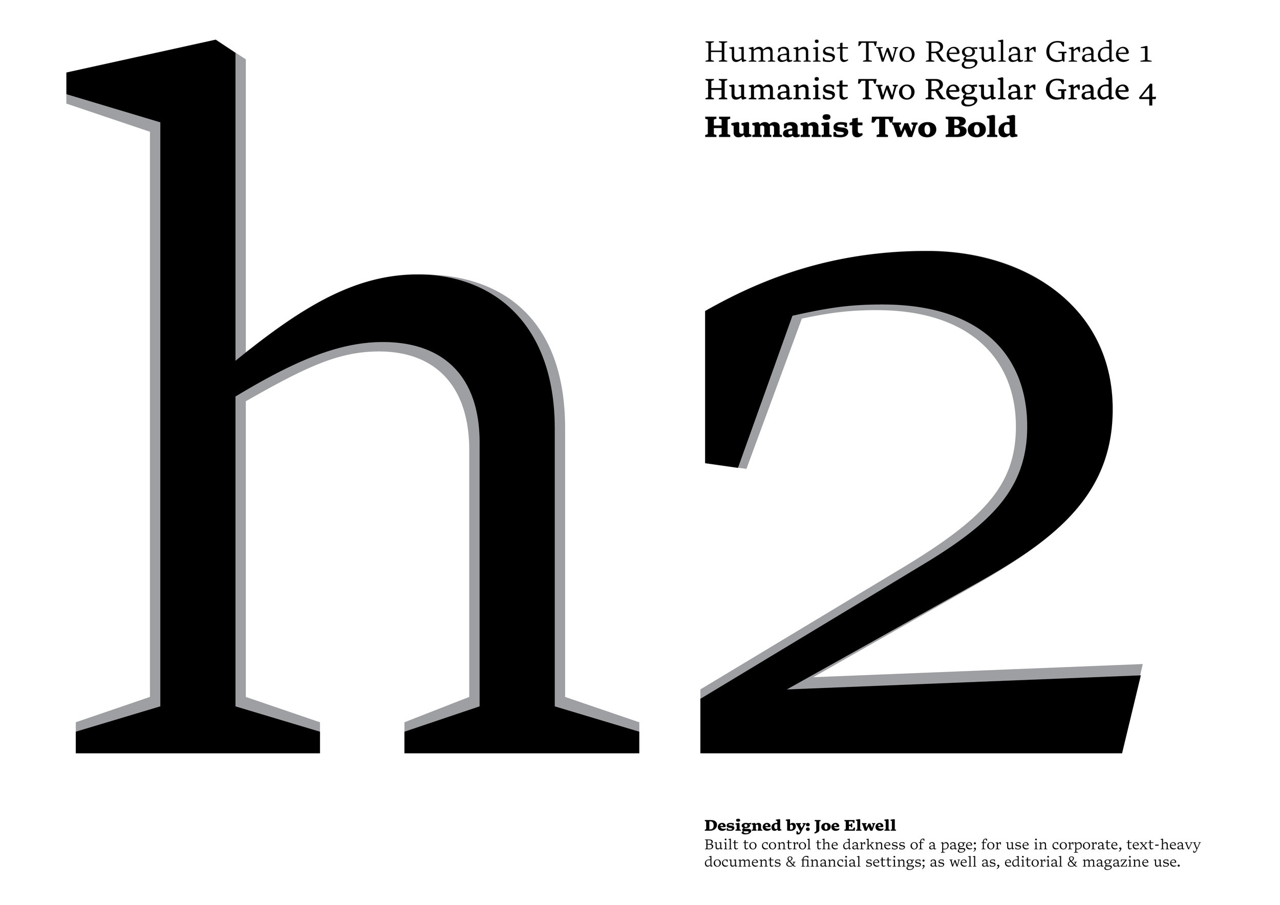
Humanist Two
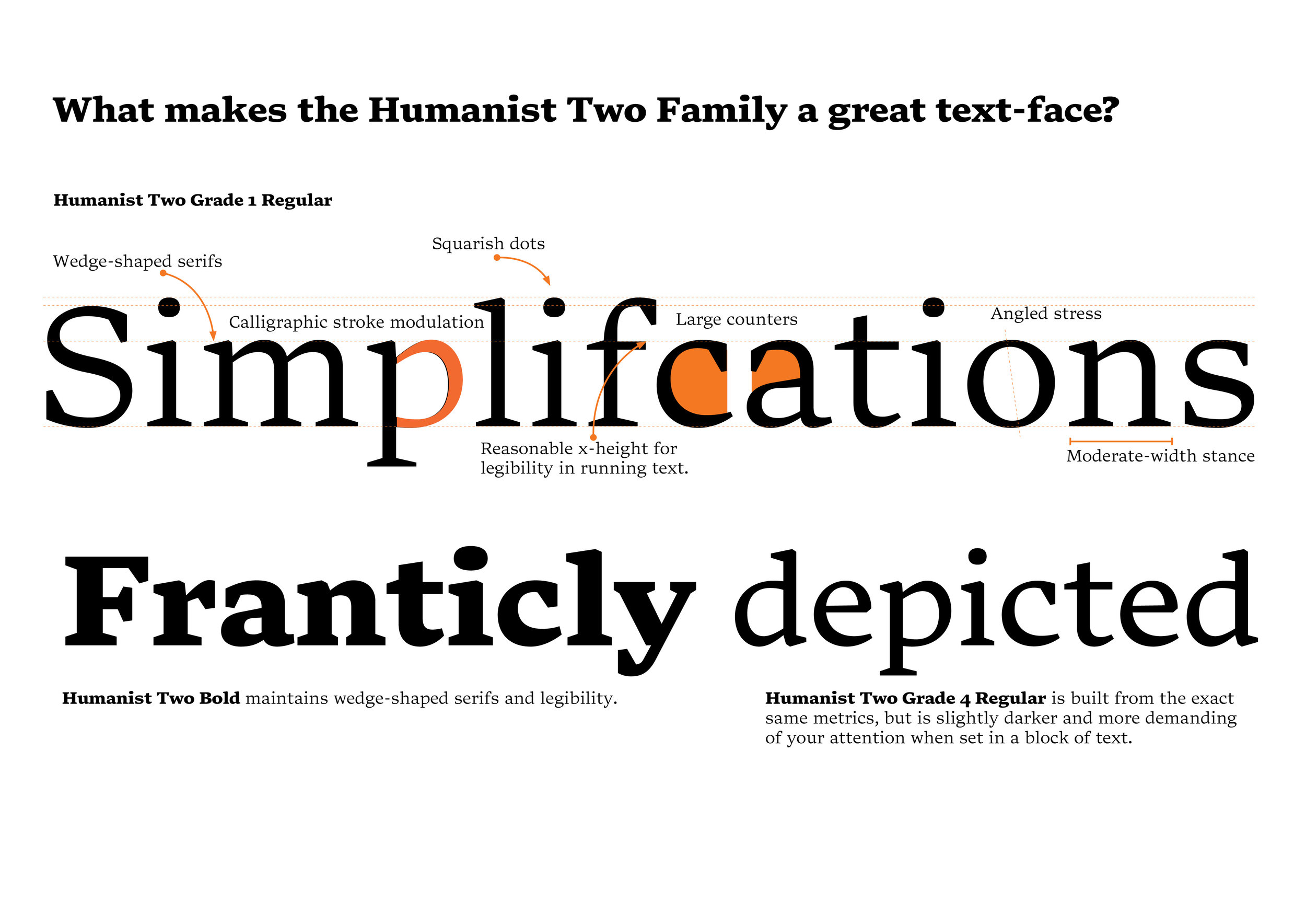
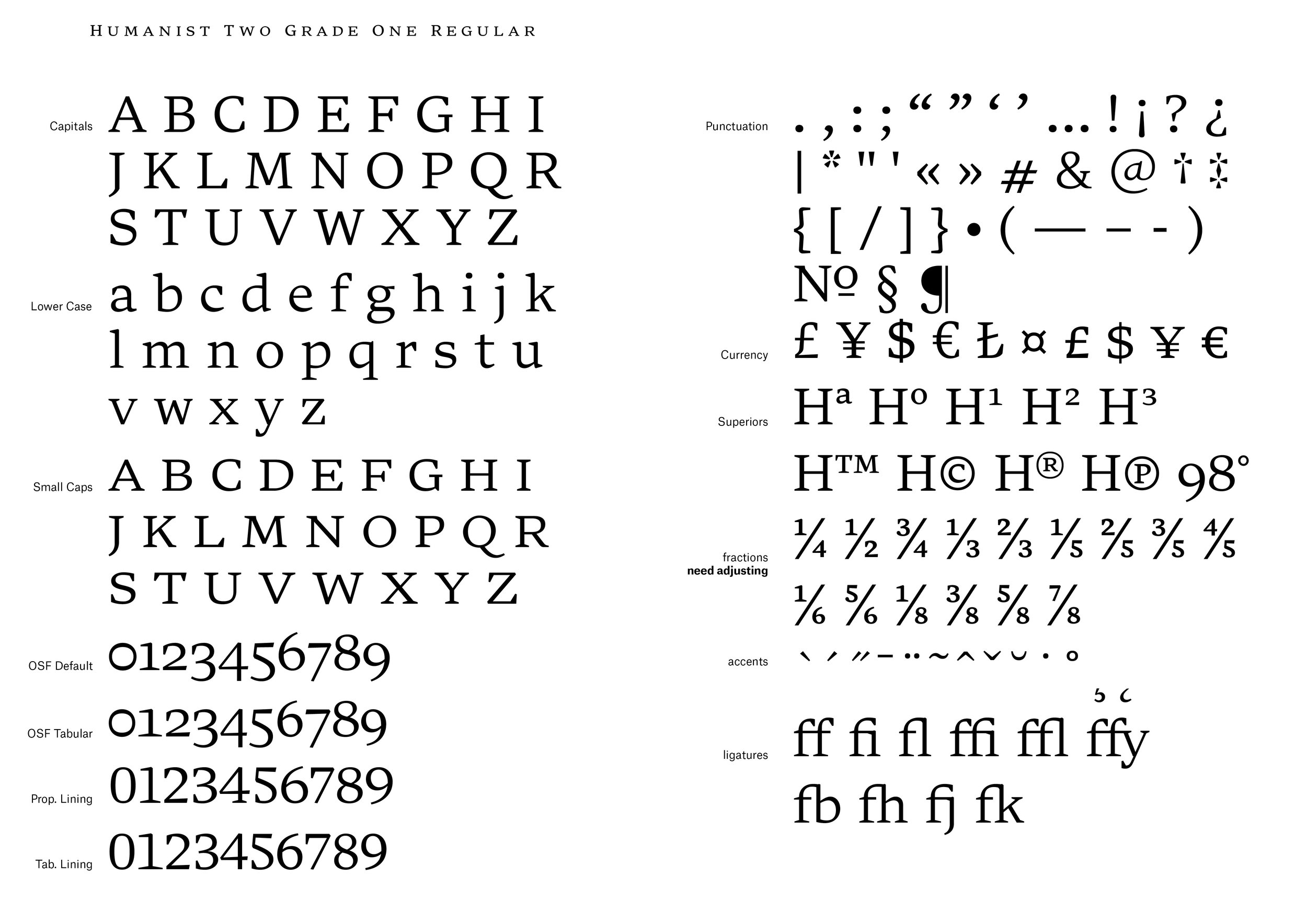
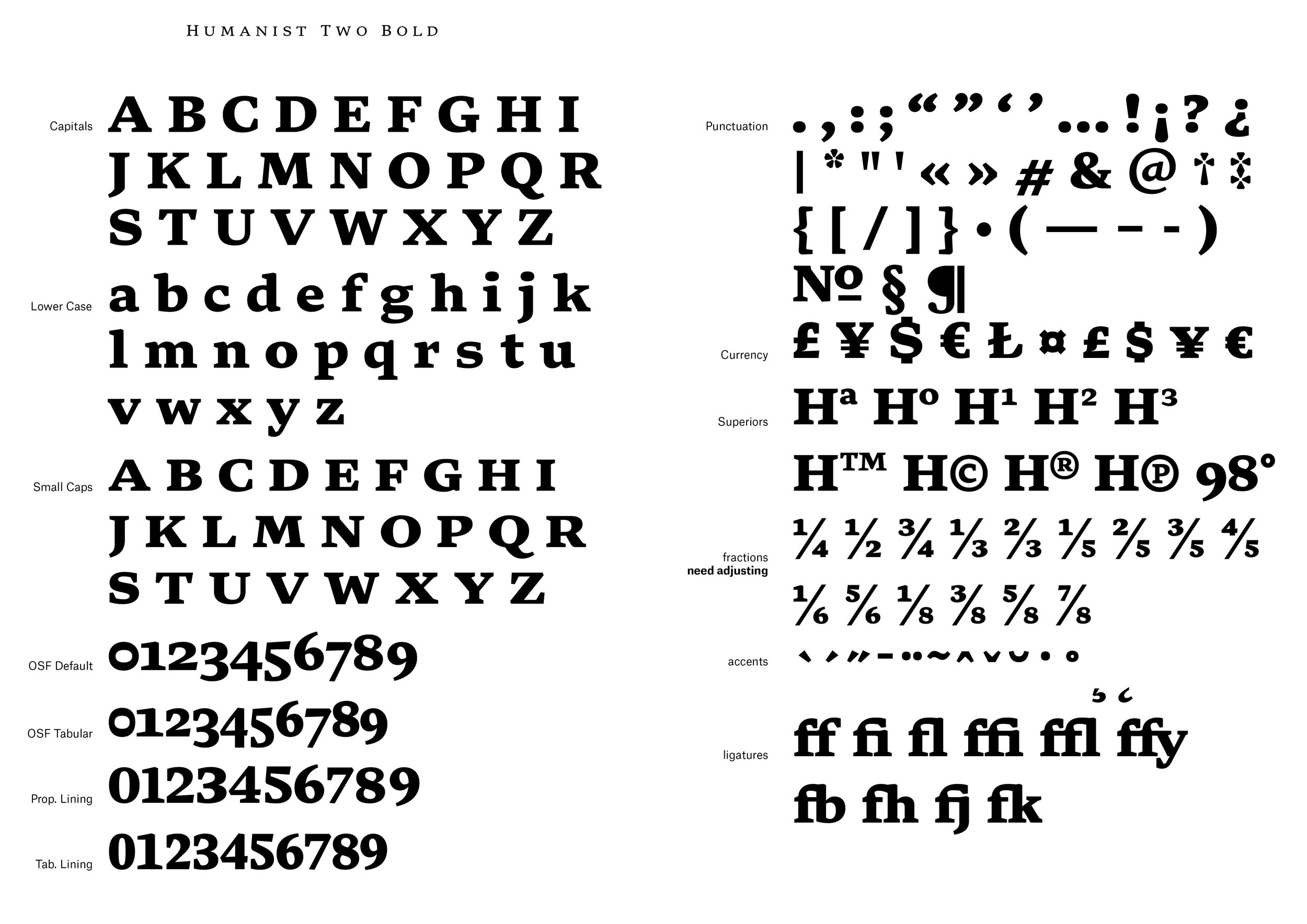
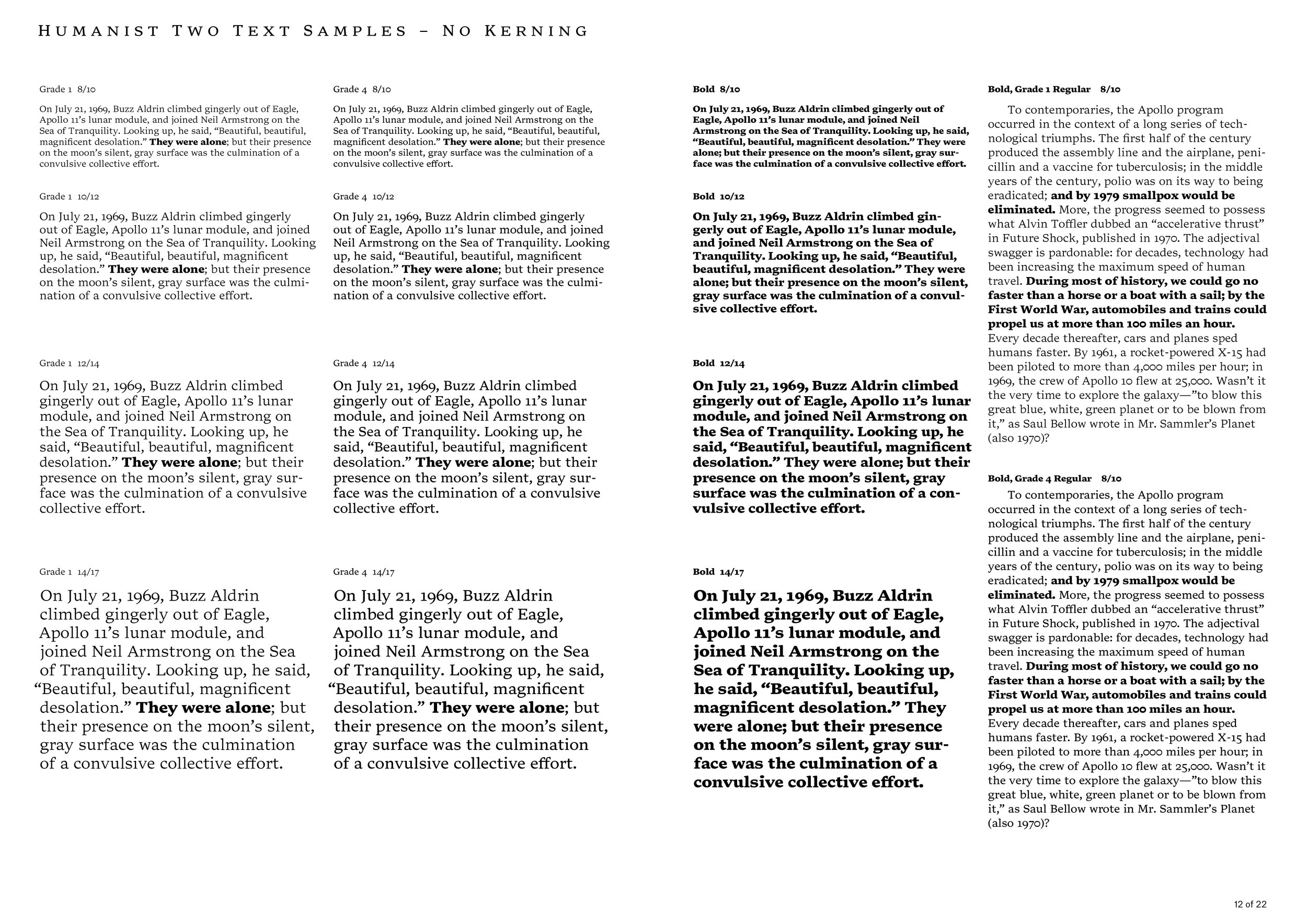
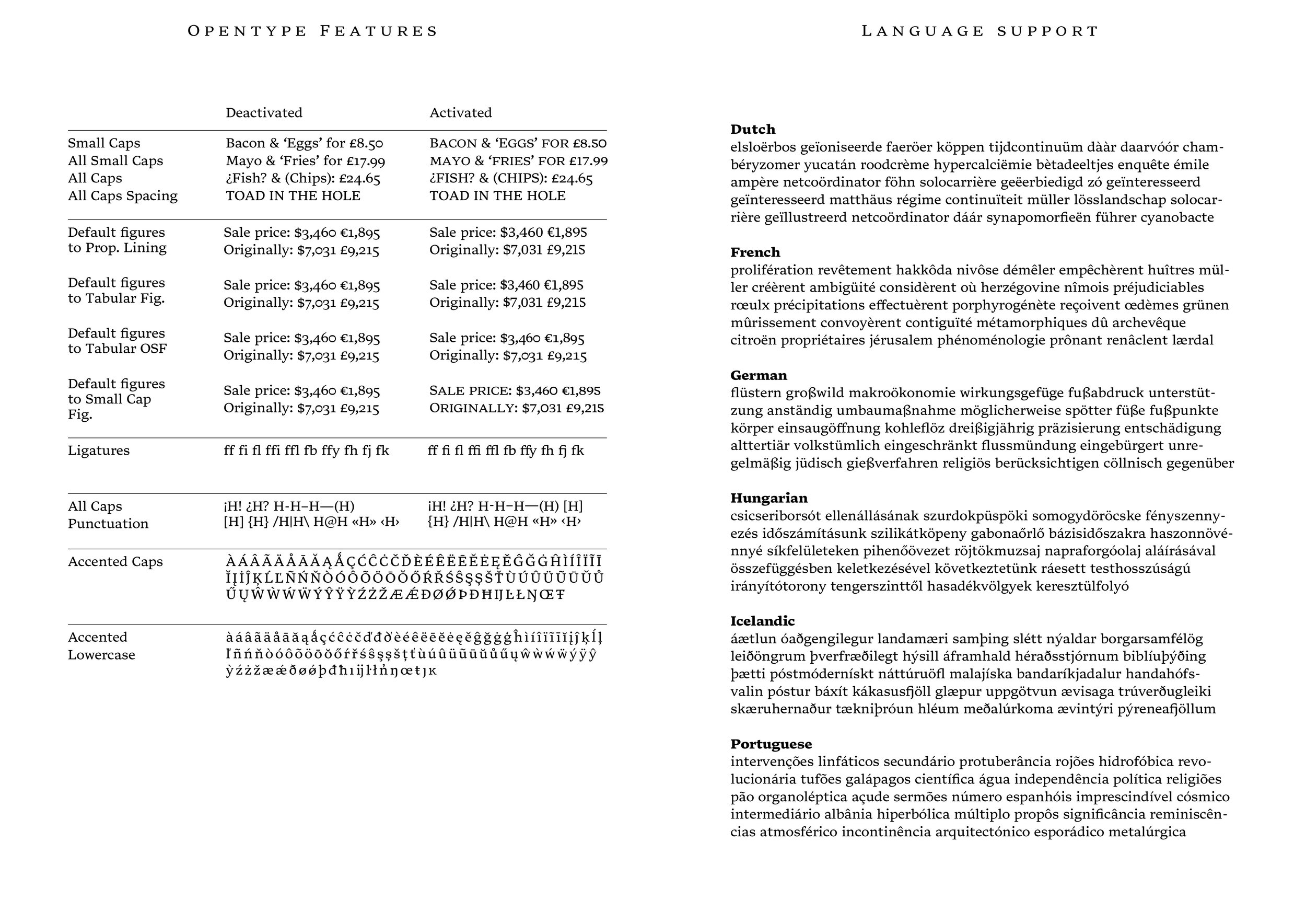
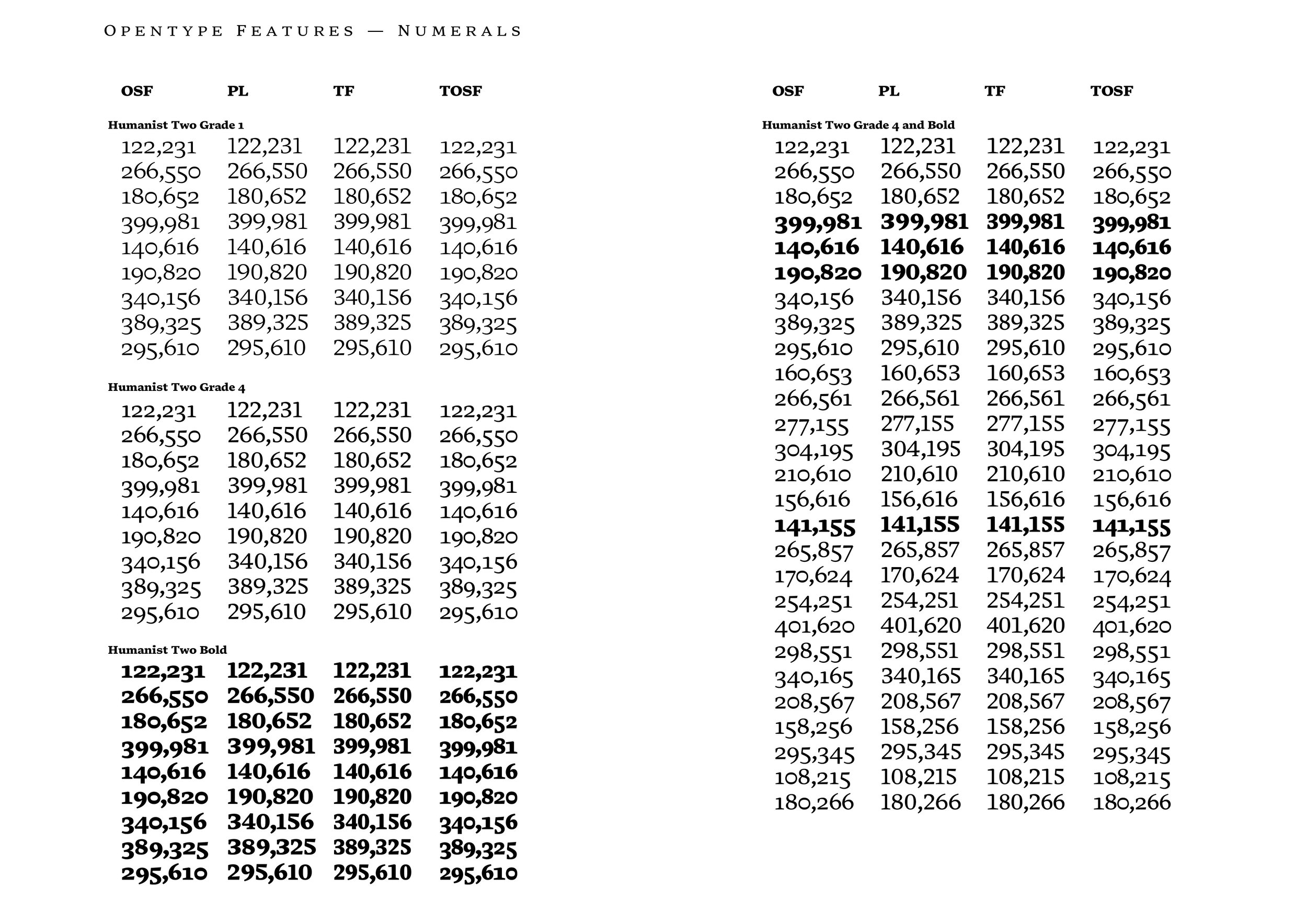
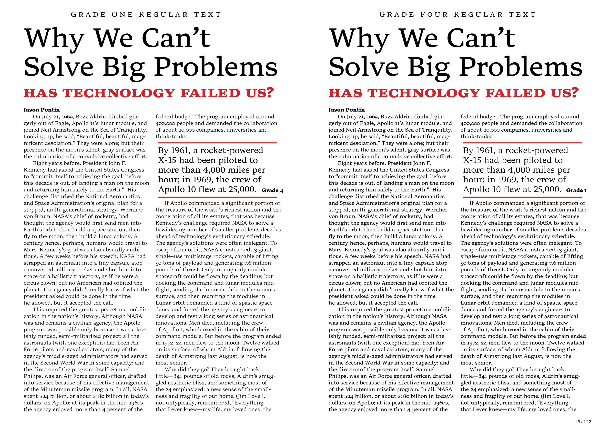
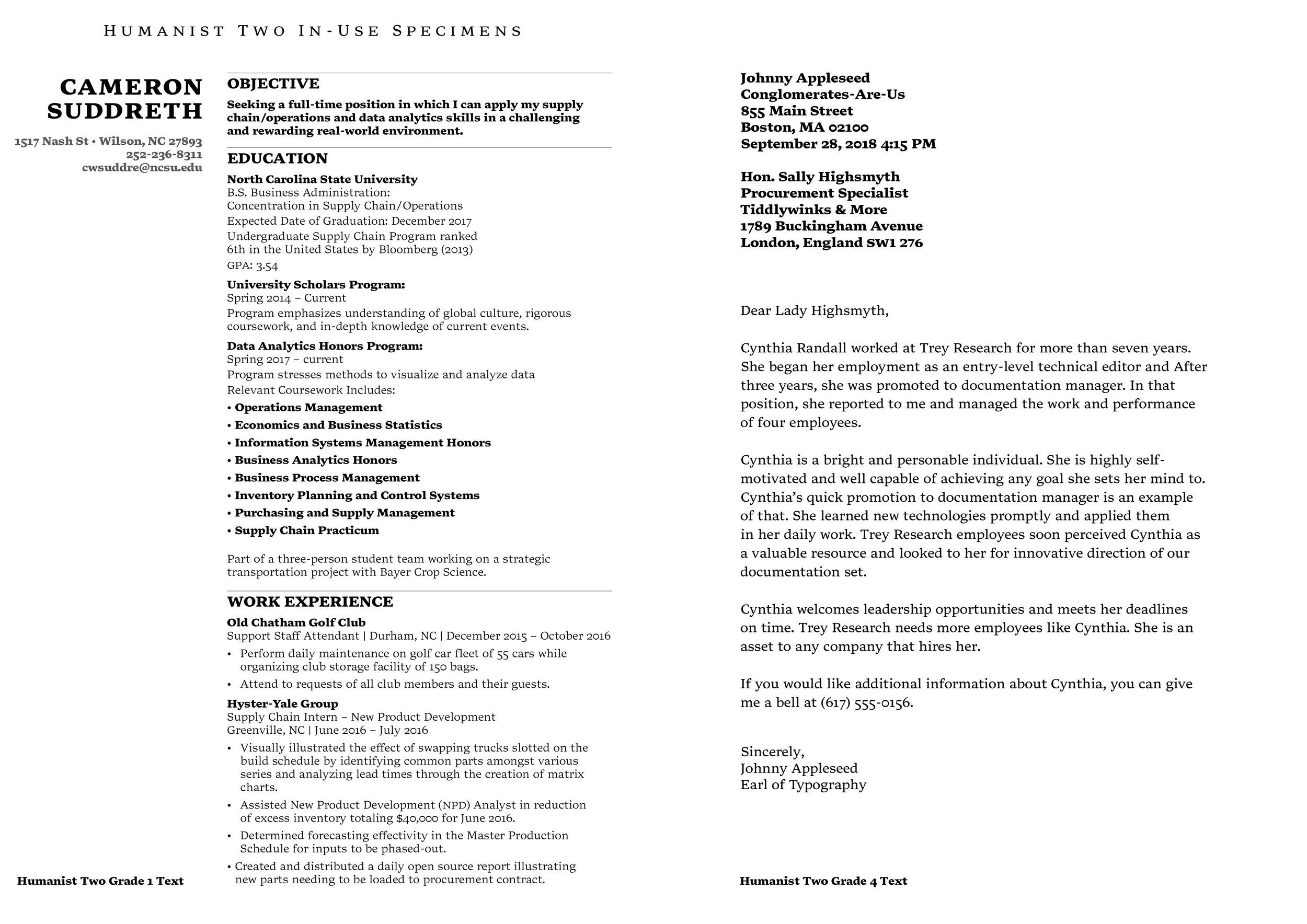
A serif typeface currently in development that explores the concept of grades. Meaning a slight increase in weight to make the text appear heavier or lighter when printed. Grade 1 is visually lighter than Grade 4. Notice the subtle difference in the increase of stem width and in the serif heights. Most importantly, the flow of text is not effected because the two grades of the regular occupy the exact same metrics, also known as duplexing. Including a bold weight which is being used to interpolate other weights with the Regular’s G1 and G4 it has the potential to expand into a 20 style family, not yet including italics. Open type features include: small caps, four sets of figures, case-sensitive punctuation, and a large latin language support with more typographic elements in the works. See the updated PDF specimen here!


Speed Tests
I took some images of interesting signage for a speed drawing exercises after being inspired by my type mentor @dianaovezea and her exercises. I took some pictures of interesting signage in my old home-town of Bath, Maine to inspire me. This is speed drawing test one of two. A geometric slab serif with a 15 degree slope. My favorite part is designing the letters that don’t already exist and using the parts of the original to surmise what makes sense.


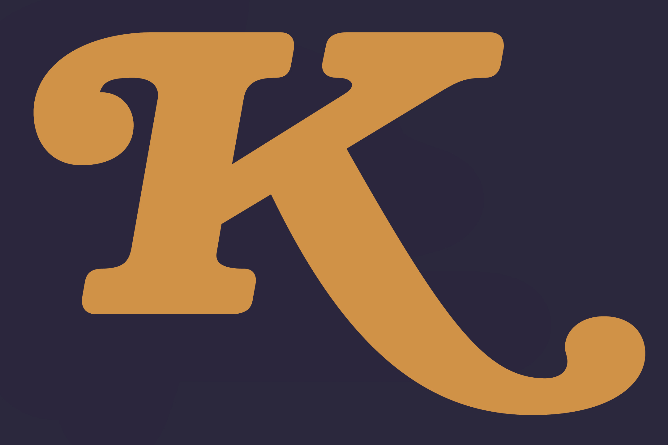
Here is part one of two of the Bath, Maine speed type challenge. This was similar to the last one in that it’s a bold italic but has a different serif-style and lowercase characters to contemplate. My favorites so far are the M, T and K.


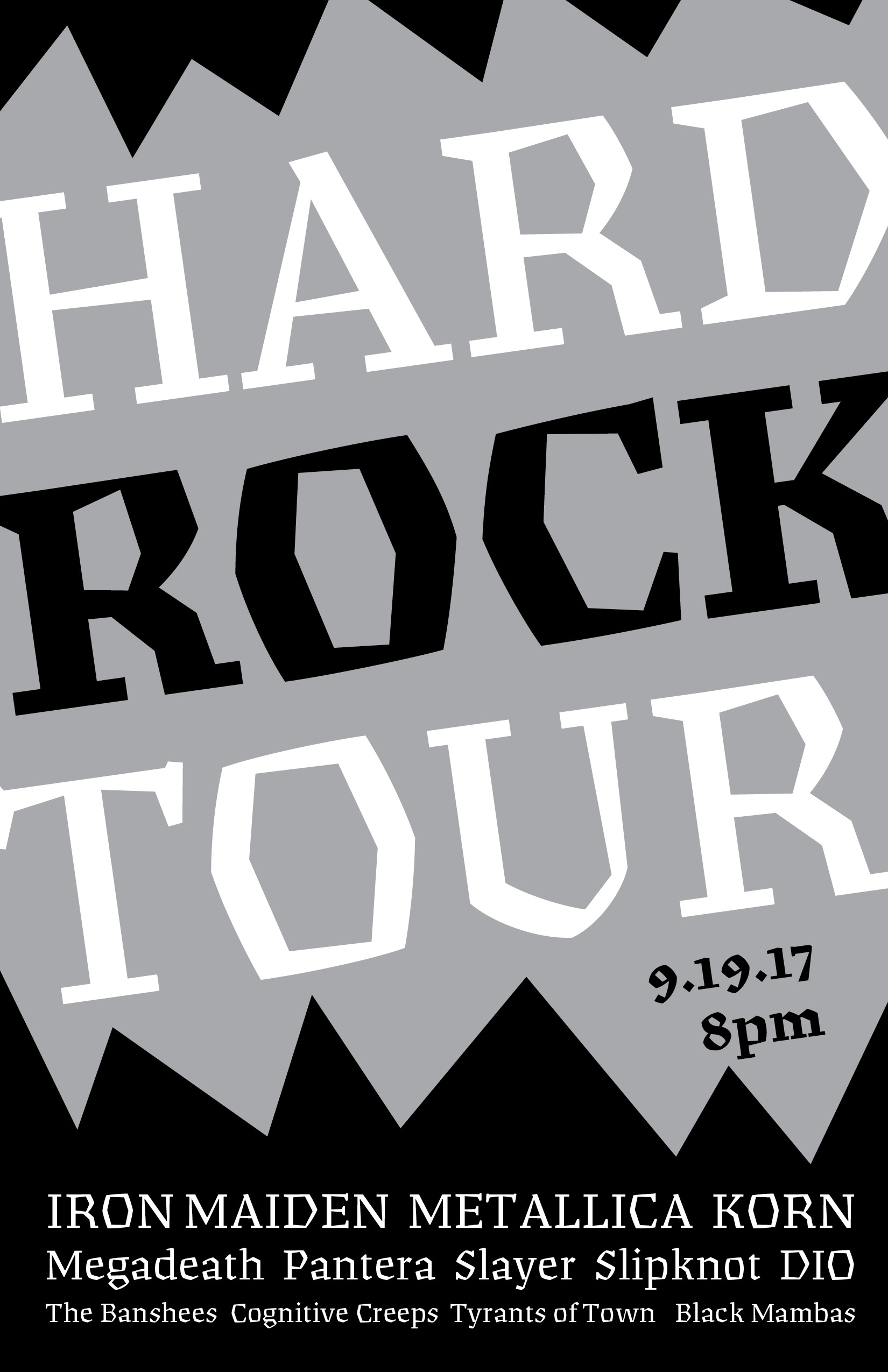
Typography Challenge
Experimenting with and practicing setting type. Making it interesting and exciting in some settings and more stable and subdue in others. This exercise is one that Ellen Lupton gives all students at MICA and a great way to learn how to control the darkness of text on a page. Typeface used is Minion Pro, which was prescribed.
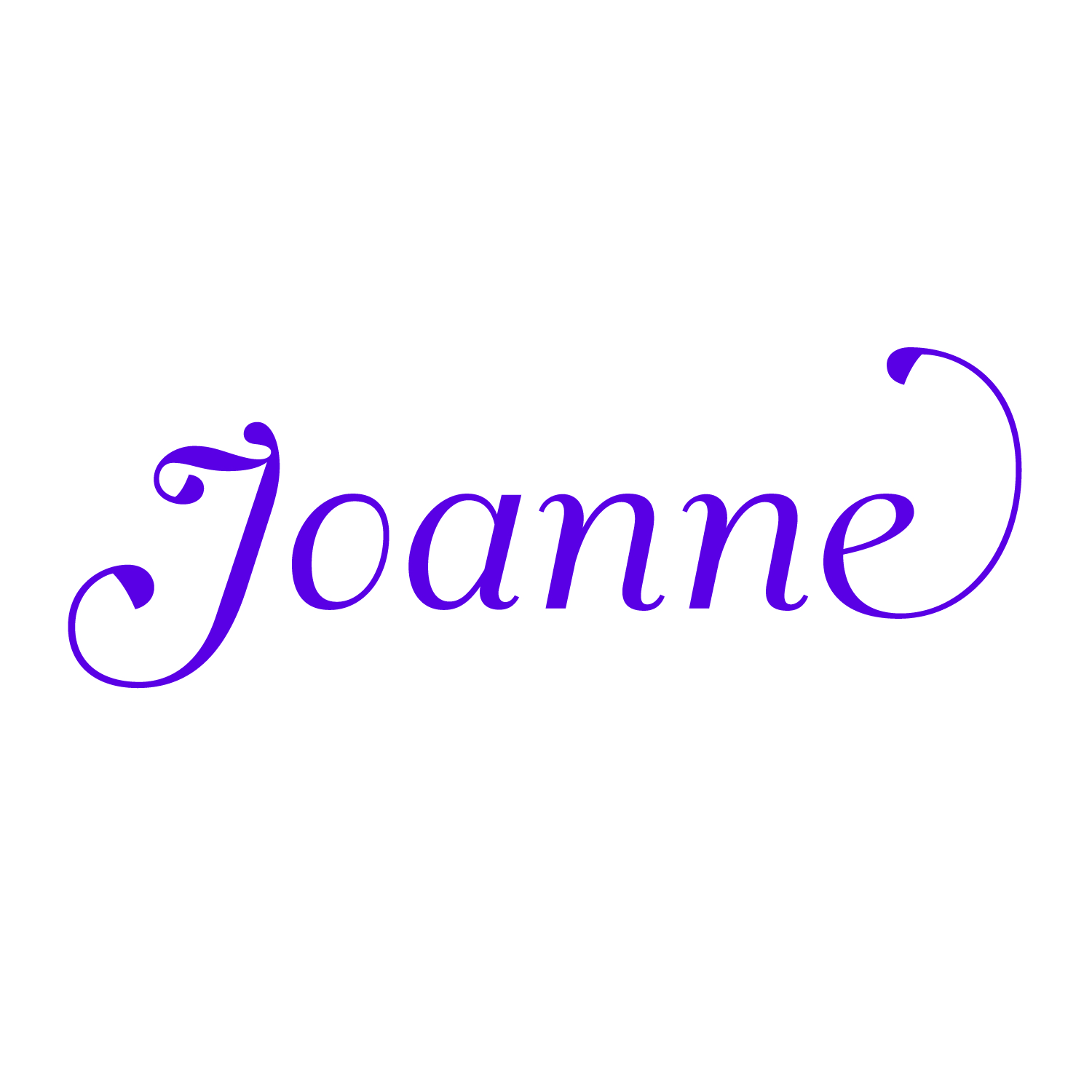
Joanne logotype

Grape Grows Typeface
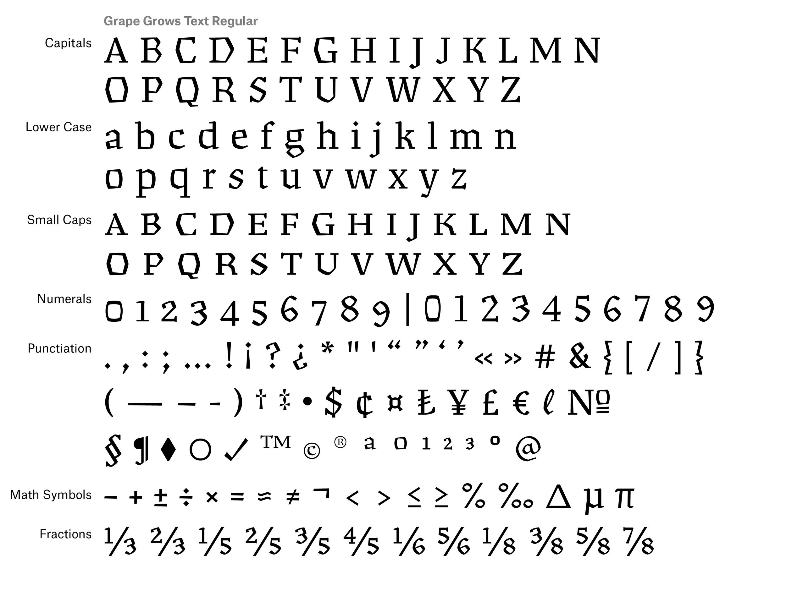
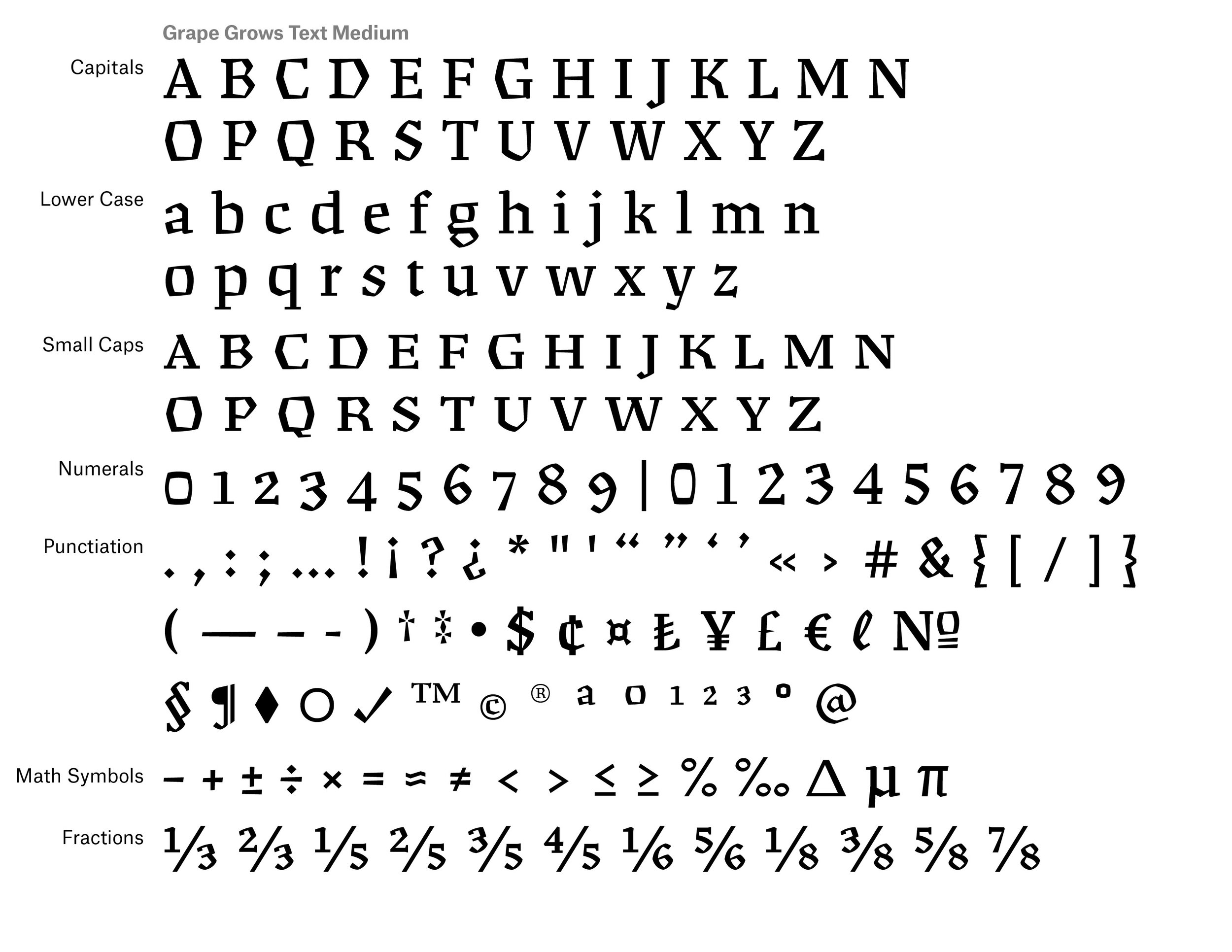
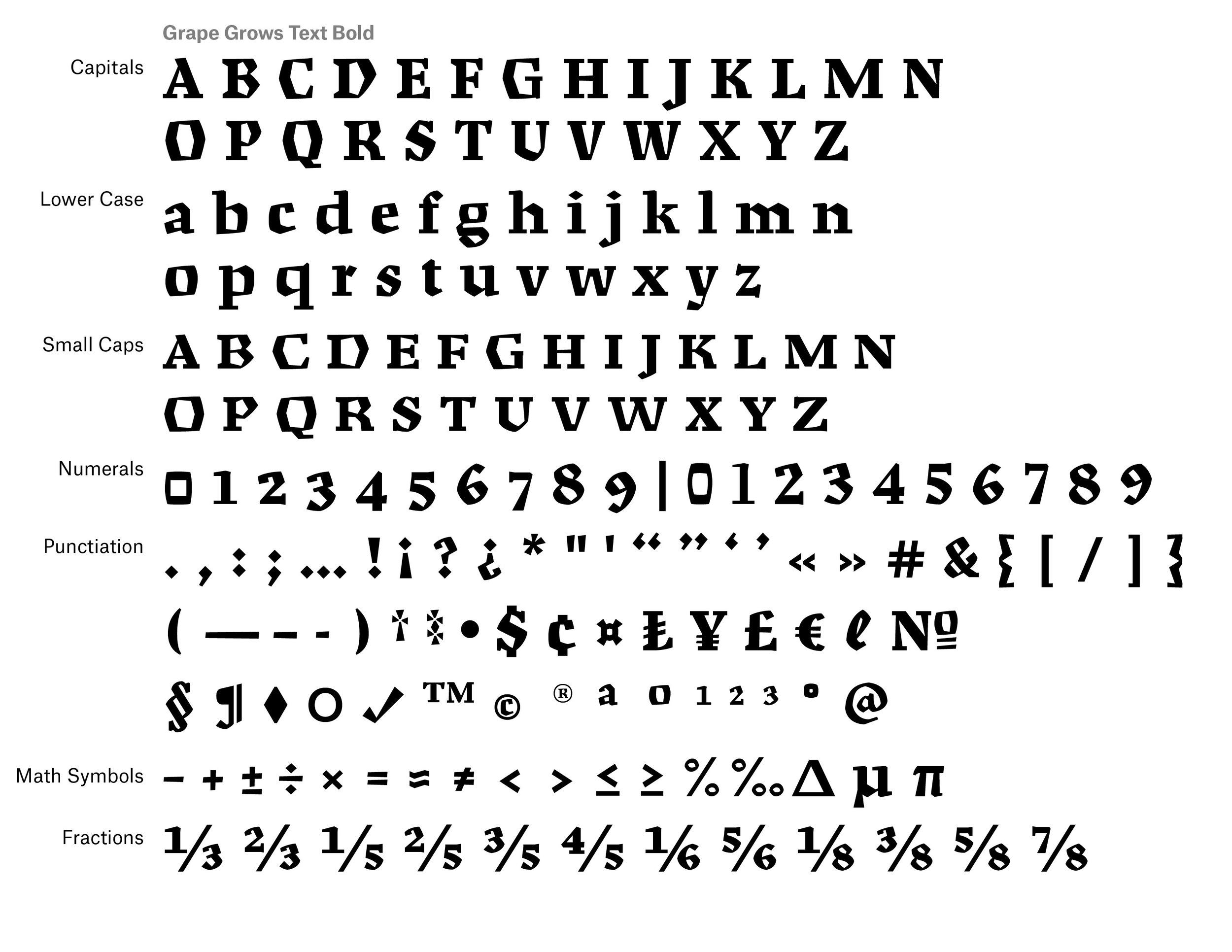
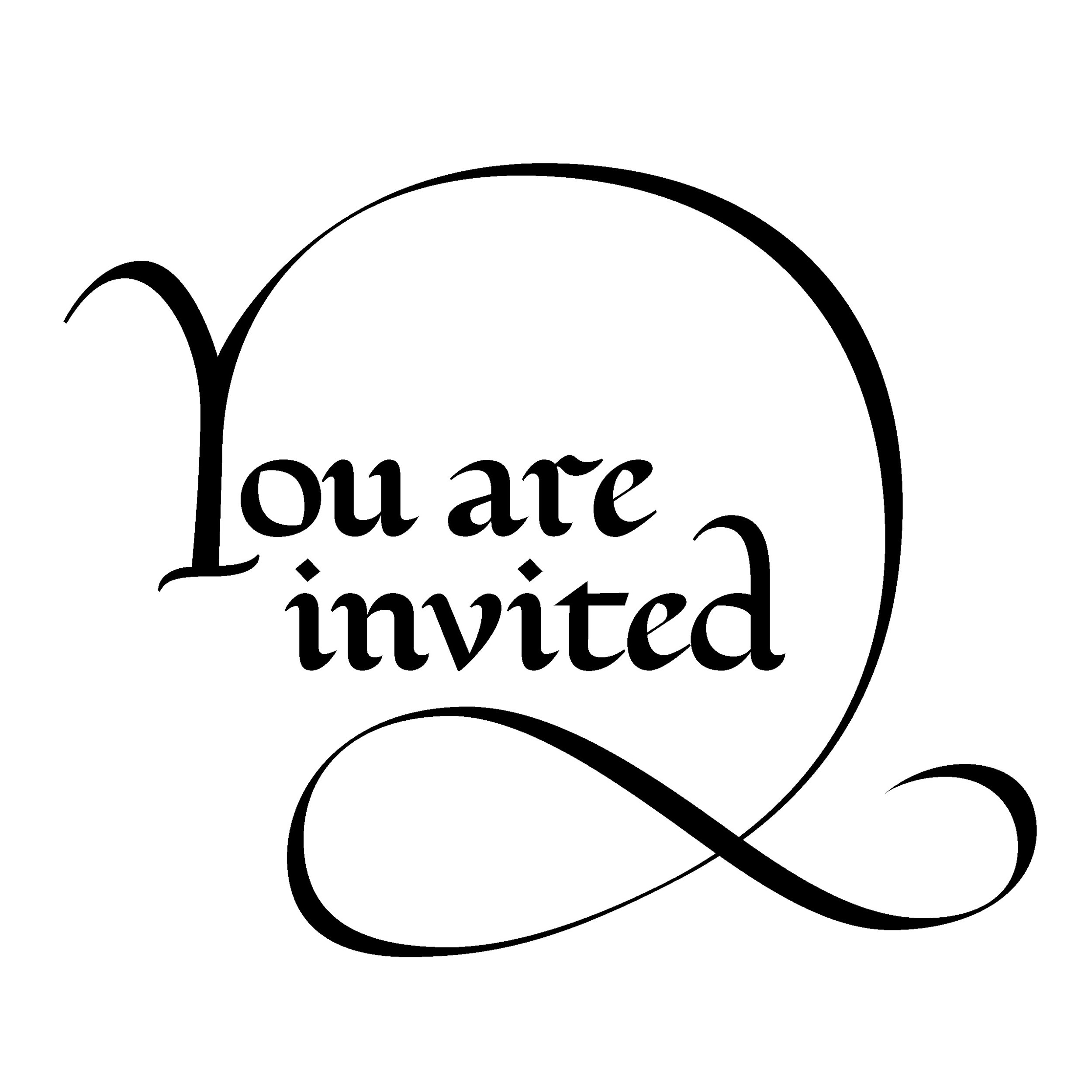
Below are a few specimens of a humanist / blackletter hybrid design I created for a soil-plant guru consultant. It evolved a lot over the last few months and really started to make progress after consulting with my typography mentor, Diana Ovezea. The Capitals and Small Caps take their shapes and structure from traditional roman caps with sharp internal strokes in more rigid style. The lowercase forms feature a humanist skeleton but are quick and sharp, like you would see in a blackletter design. This is most noticeable in characters like b, p, q, d and o, c, e. Although, not shown yet, there is extended latin support for over 80% of the languages spoken around the world. Some additional features of this type family are ligatures, stylistic alternates, fractions, lining figures, tabular figures and punctuation as well as Uppercase punctuation.


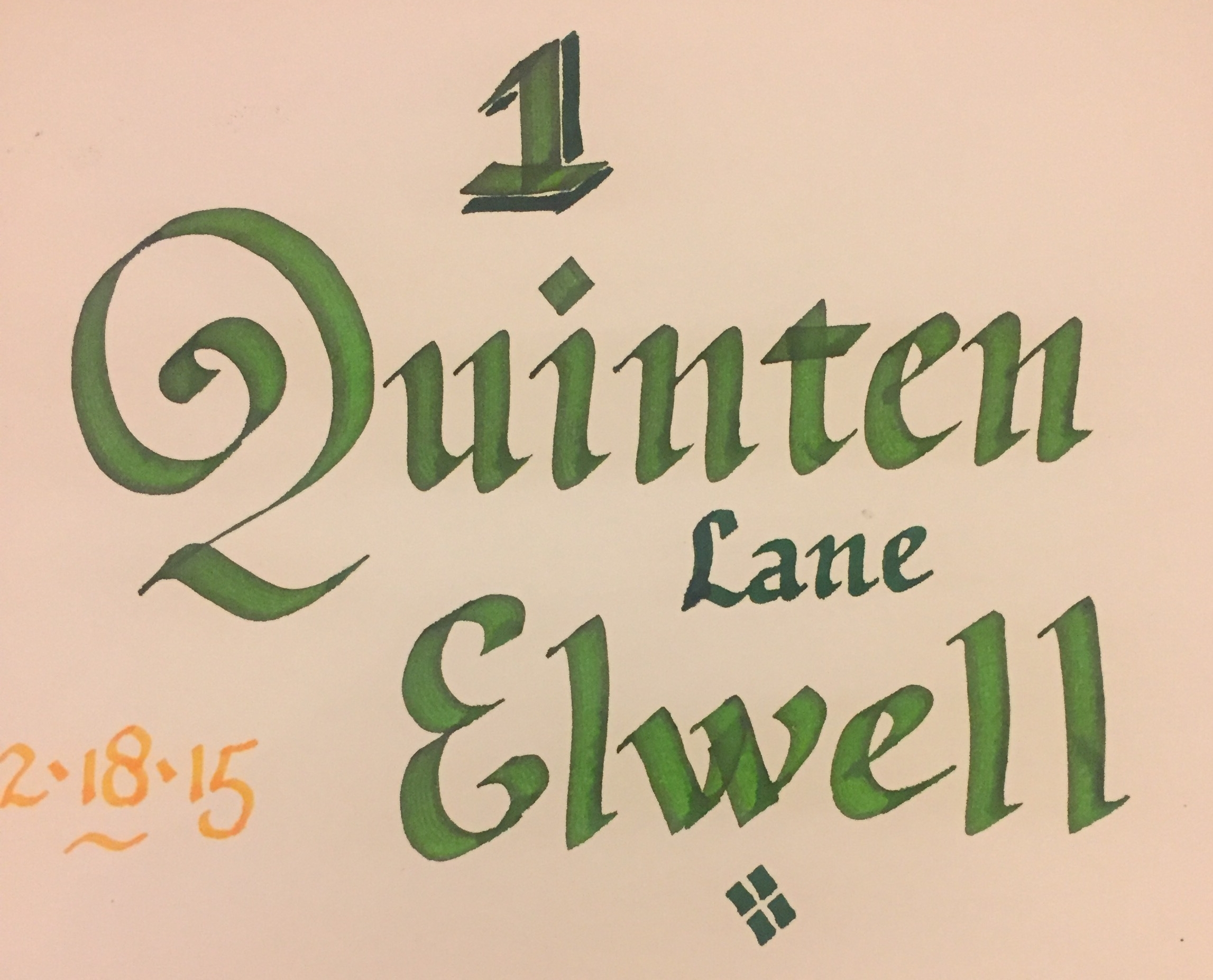
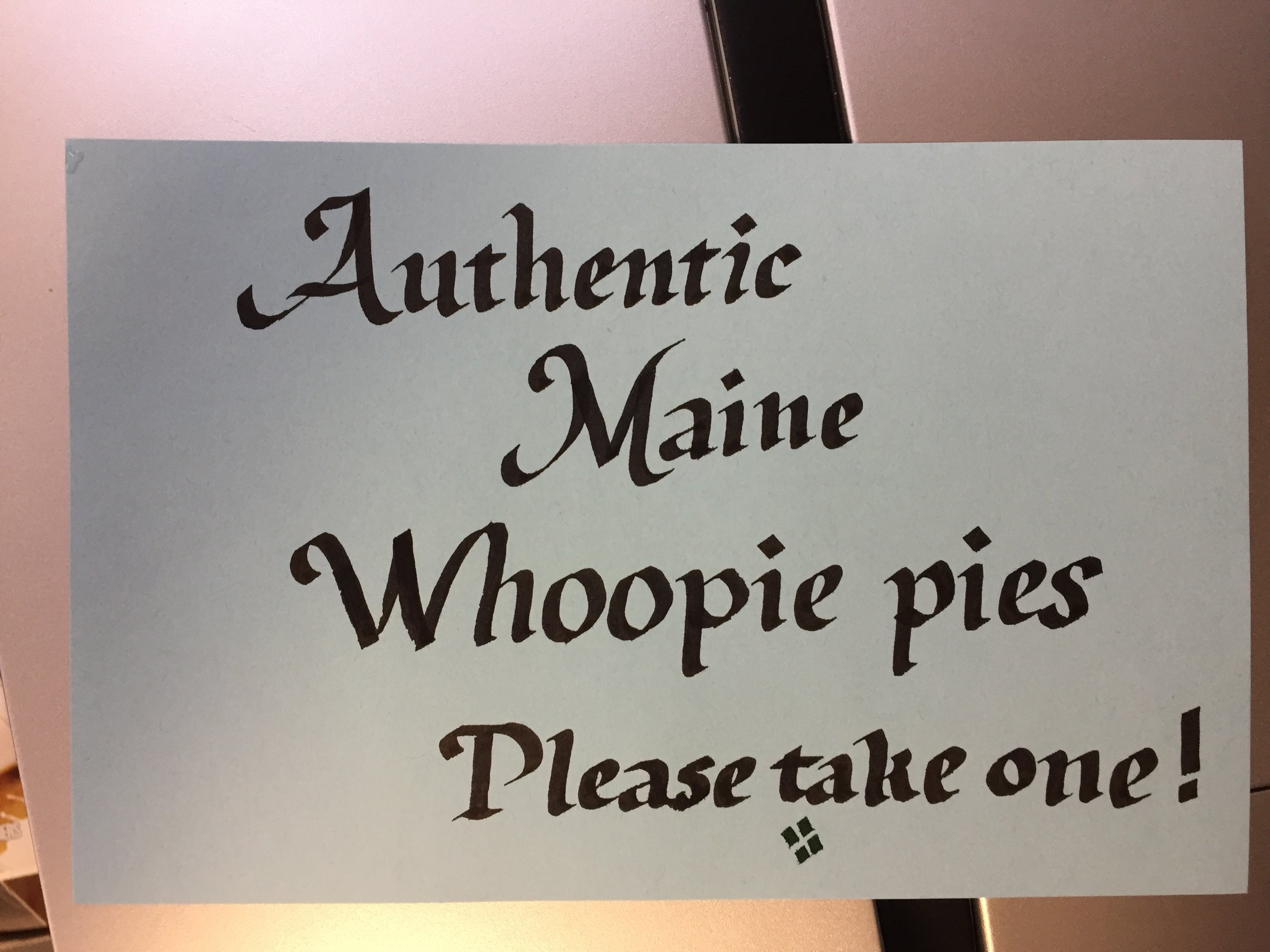
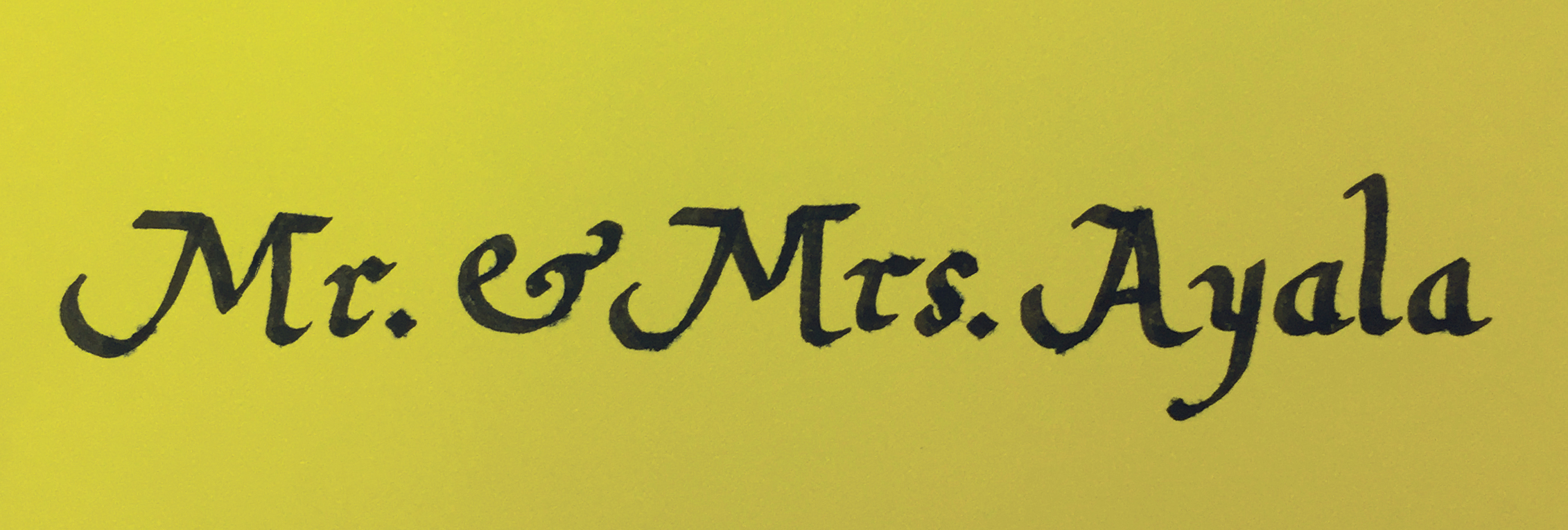
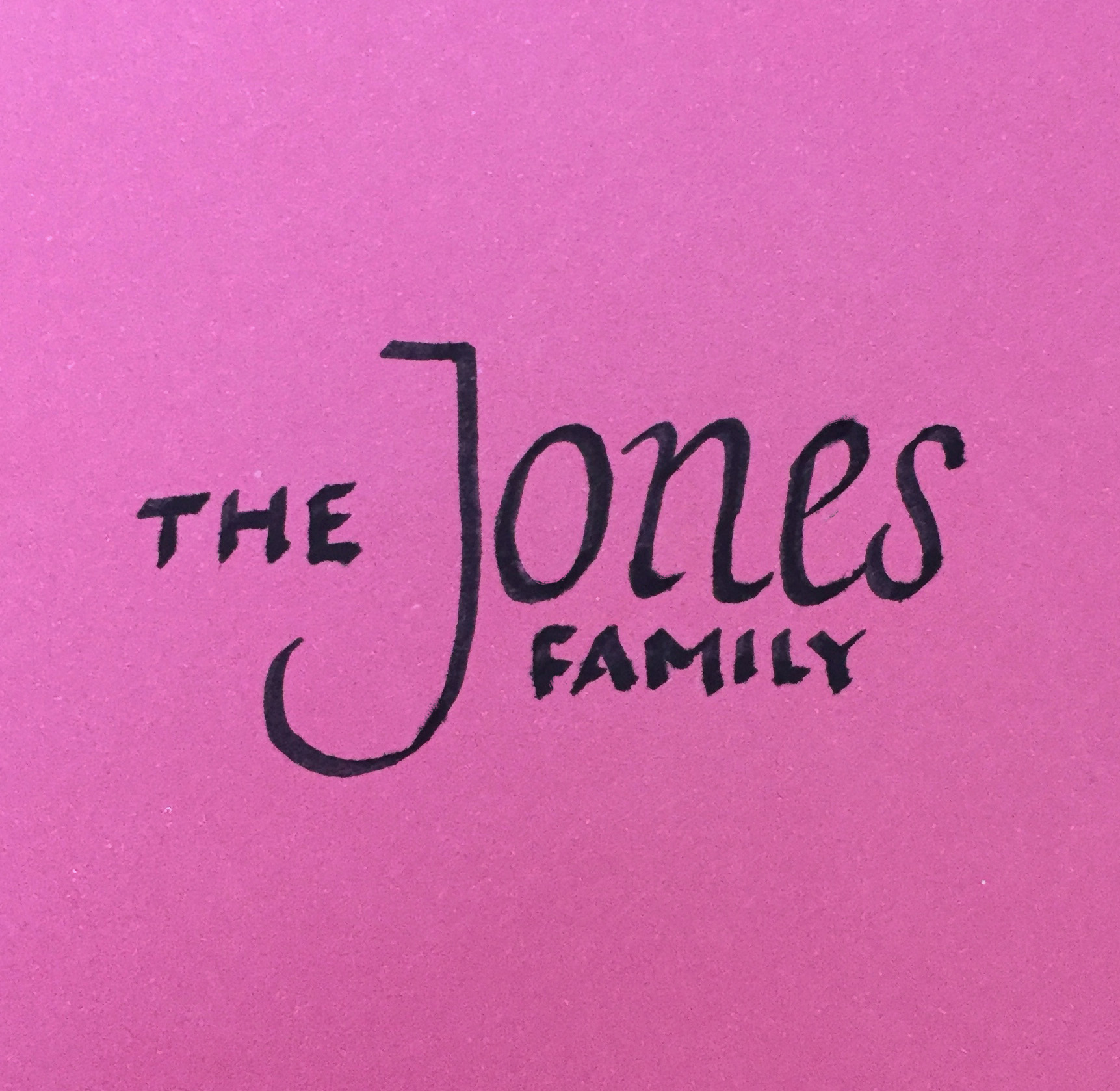
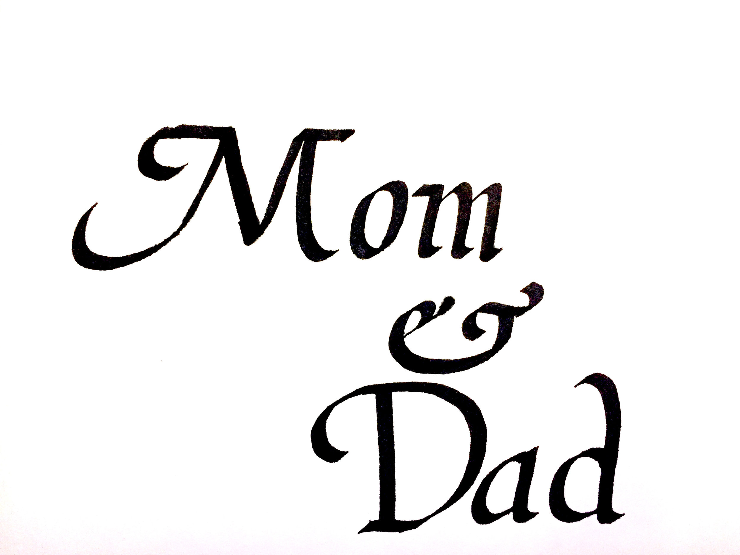
Calligraphy practice

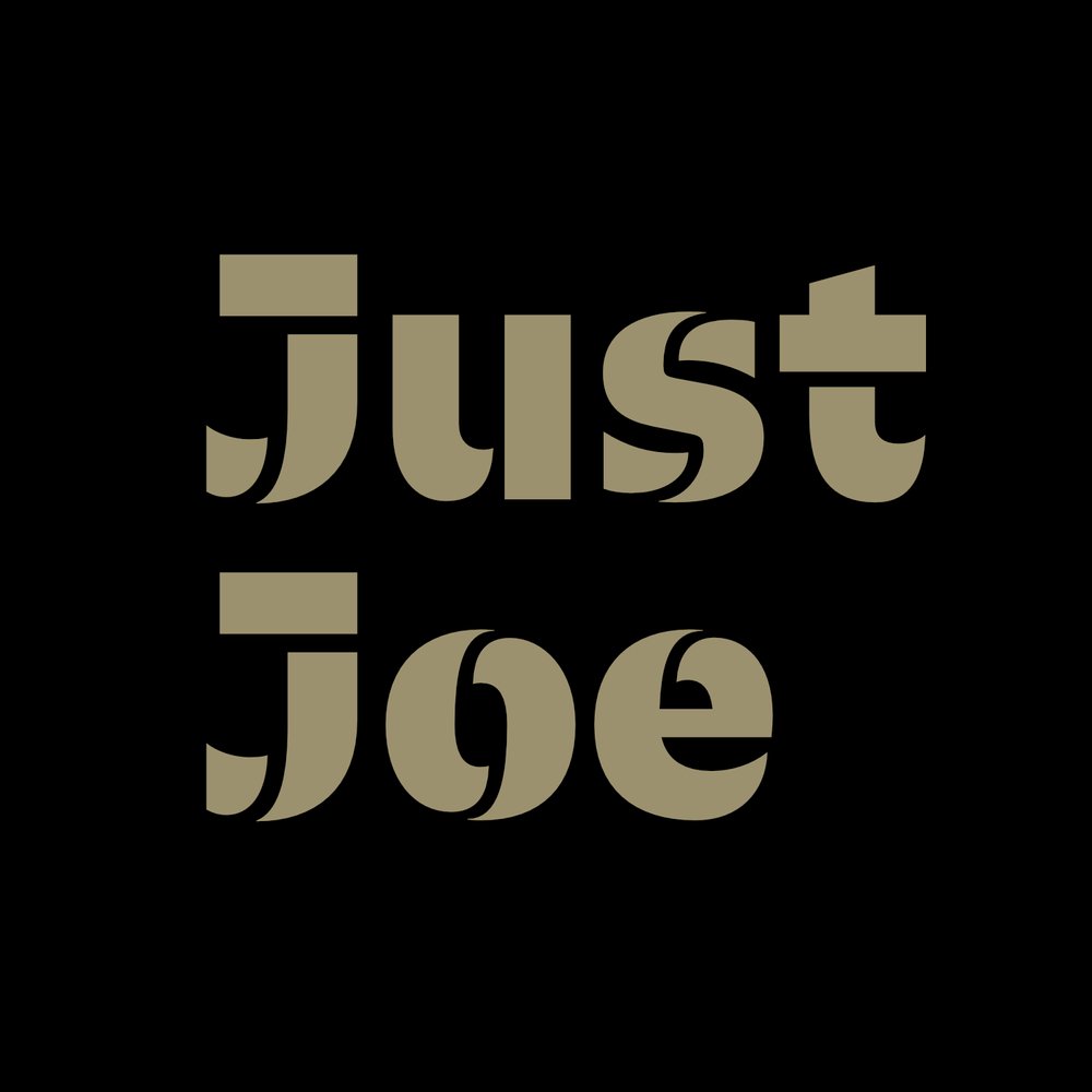
A bodoni design, I call Joedoni in magazine layout mock-up. I've been working on this design for the last couple of months and have created 4 weights: thin, regular, bold and black, which is the style used below. The lesson with designing this style of typeface is to get all of the thin and thick strokes consistent from one letter to the next, create smooth curves and learn spacing for a display face. For now this design is finished until possibly re-visiting in the future where italics could also be added.


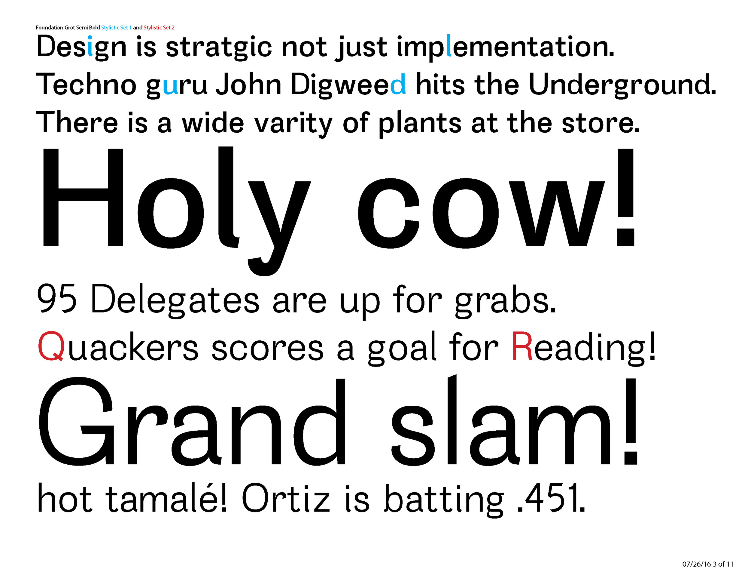
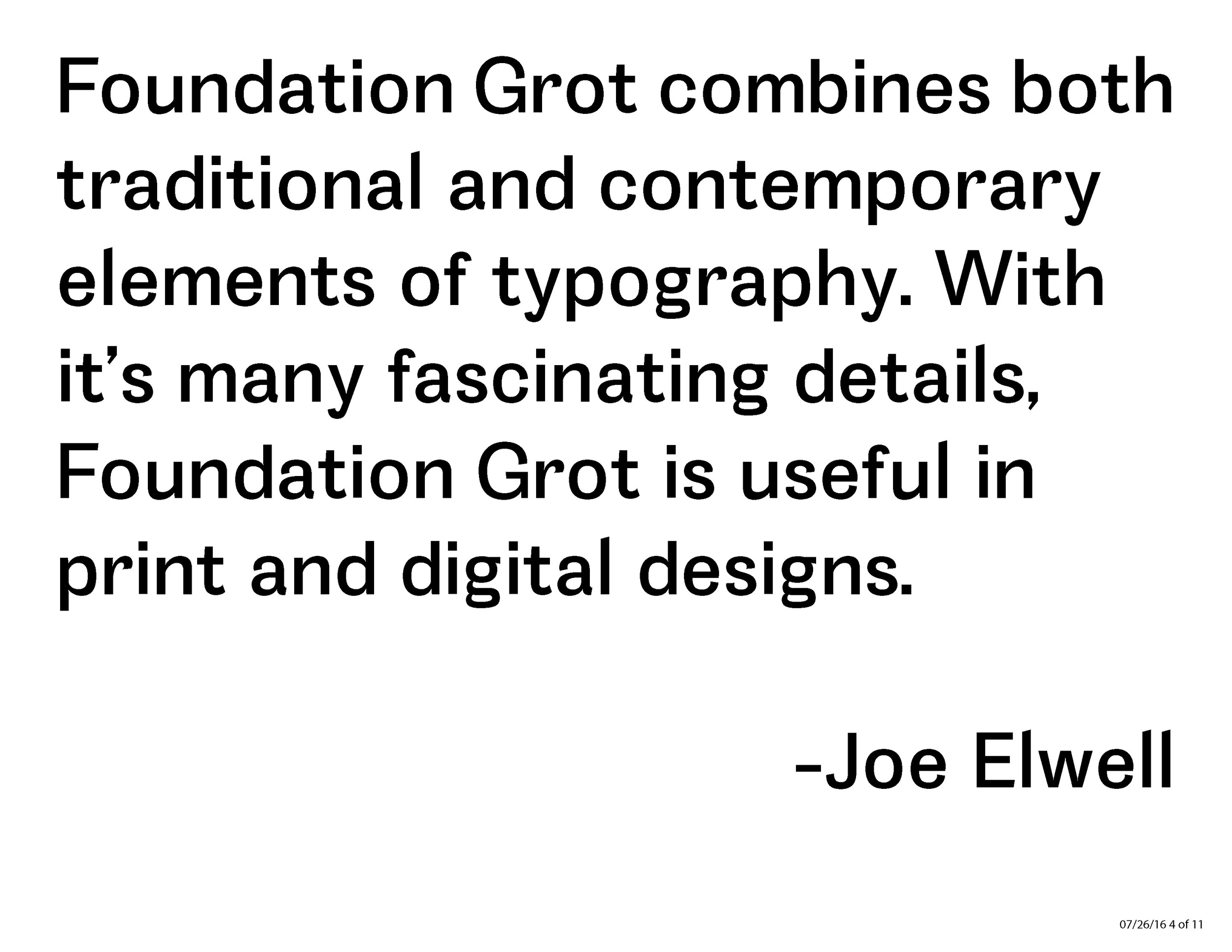
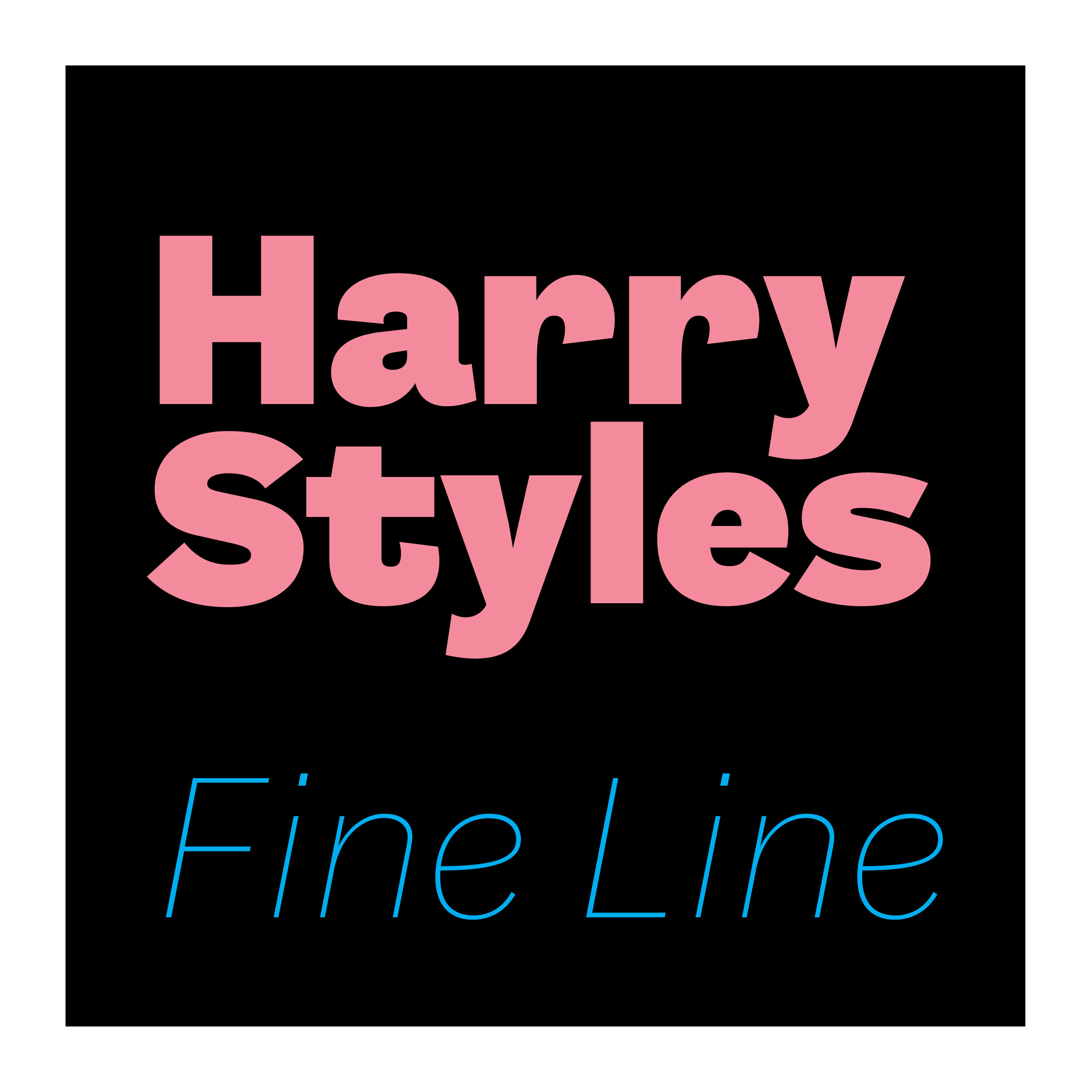
I've been really interested in typography and type design the past couple years. As a result of my interest, I created the design above. It started out a basic humanist sans, but have been growing to really appreciate grotesque faces with a flair of calligraphy, much like Bureau Grot designed by David Berlow and others at The Font Bureau. There are still some weaknesses to this design, but feel that it is a good start and hope to continue working on it and expanding the face to multiple weights.