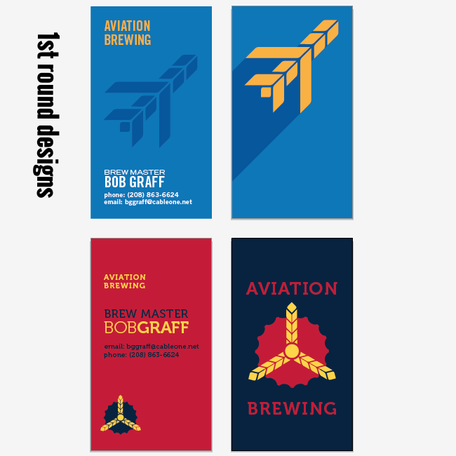
I was hired to design a logo and business card for a retired pilot turned avid brewer. The design concept was really quite open-ended and completely up to me as far as direction of where the design went. It did originally start as a gift from the brewer's daughter but her schedule was too busy so the retired pilot and myself worked on the final products together. The name of his "business" is Aviation Brewing, which he doesn't sell his booze but brews batches and gives to people a few times a year. I wanted to develop, for him, a unique mark that incorporated both aspects of the company's name: aviation and brewing. Resulting in a design that is somewhat obvious but memorable.
He really enjoys the work that goes into brewing beer so the identity had to appear somewhat crafted but "well-built" to elude to the care he takes. So, I designed two, in my opinion, strong concepts to choose from and took some time before coming to a final decision.
The Bottle Cap (Option B) was the design he chose in the end as he felt it would look better on T-shirts and other materials. Part of the reason for the design choice of the three propellors was that he has an affinity for three prop planes and is an owner of a Cessna 182. So it shared that quality which I think was the ultimate reason it won. The bottle cap that encapsulates the propellors is also similar looking at a plane face on. An original idea I had was with the propellors extending beyond the cap like a Cessna.
Overall, I think this is a fun design that can be well executed across all sorts of collateral.
The typeface chosen was Jos Buivenga's Museo Sans since it is fairly unique and recognizable, plus it helps that it is free for my customer to use in several weights.


